Complete Rebranding of a Startup to Earn Client Trust and Attract Talent
*Click any image to quickly cycle through
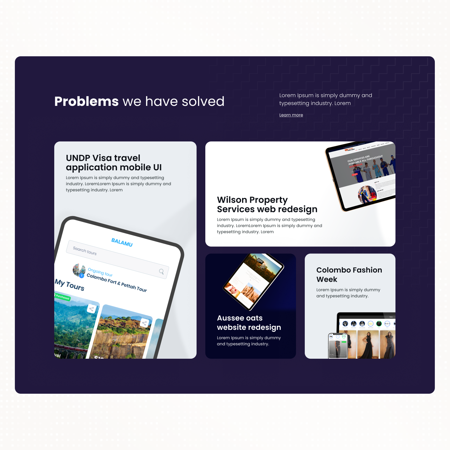
Summary
Smokingdots is a full spectrum development company that is focused on web and mobile development targeted to be a technology arm for anyone. As they were gaining some traction having worked with a number of reputable clients the company was looking into the possibilities of updating their brand and website.
The current site was not meeting their expectations and was not providing them with a good way to carry out sales and attract good potential hires.
Problem
Having worked with Smoking Dots before I was brought on to work on the new brand identity and reimagine the logo and the website. This is the process I took with the stakeholders of smokingDots in order to create the website.
Logo design
Current logo
The old logo for smokingdots — a young tech startup that is a full spectrum web and mobile application development company — was having some major flaws that were becoming a hindrance to the brand.
Issues of the current logo
- The logo is not easily readable.
- In small scale the logo simply reads “dots” as the “smoking” part is too thin.
- The logo is not simple — there are too many effects such as negative space, italic type, and a mix of thin vs thick typefaces.
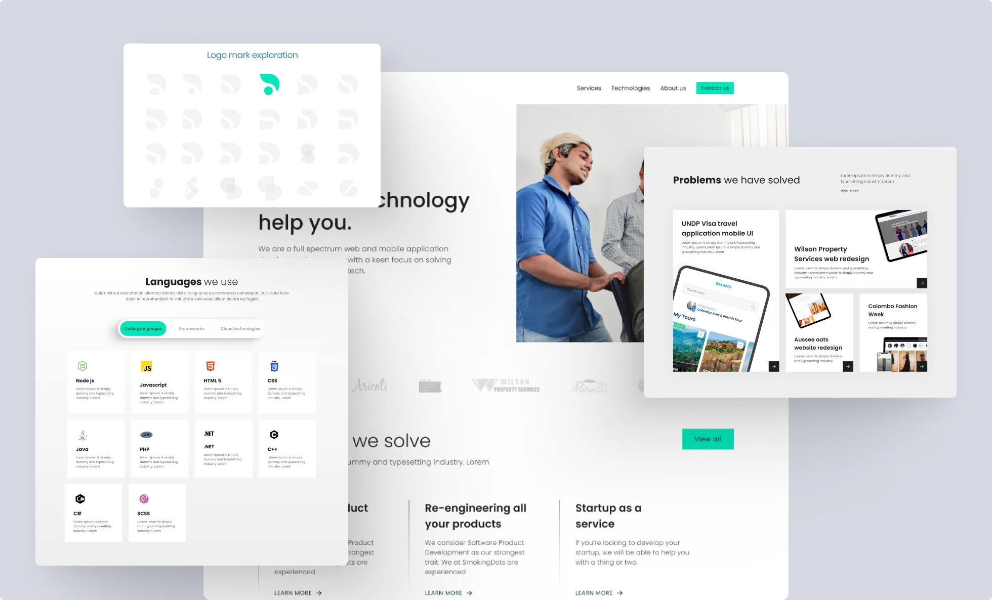
Introduction of a logo mark
Having a logo mark seemed to be the best way to go forward as the word “Smokingdots” was too long to be added without making the logo too complicated. By introducing a logo mark I will be able to make sure the brand is recognizable just with the mark, and the company owners can easily choose which places will need just the mark and which will need the full logo.
Anatomy of the Smokingdots logo mark
The logo mark was constructed using the “S” and the “D” in Smokingdots. Using the negative spaces created when placing the two letters together produced a very simple logo mark that is easily recognizable and understandable — it also creates the look of a dot with a smoke symbol rising from it.
Final outcome
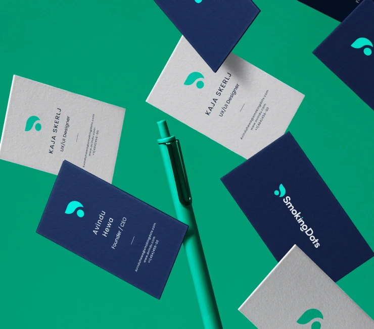
Outcome
checklist
- The logo is easily readable.
- Logo mark is legible at small scale.
- Simple logo — minimalistic and easily identifiable.
Website design
Why
Before starting the work we had a meeting to understand why they needed a new website and what the issues of the current site were.
Current website issues to be addressed
- With the rebrand the site needs to be aligned to the new brand.
- Current website does not get many return visits from people.
- There are complaints from visitors to the site.
- The amount of business coming from the site is quite low.
- Current website does not reflect what the company does properly.
- There is no proper direction to the site for different types of visitors.
- Proof of work is not provided properly, which makes the brand look less trustworthy.
- It's hard to attract potential employees with the current site.
Project success points
- Follow the new branding.
- Be easy for the visitor to navigate.
- Provide pipelines for different types of visitors to find what they want.
- Reflect the values of the company.
- Provide ample proof of the capabilities of the company.
- Easy call to actions for a visitor from anywhere in the site to reach out.
- Be people centric.
- Support downloadable and shareable content.
- Show off the process the company follows.
- Be something the stakeholders can be proud of.
Current website audit
We decided to break down the existing site to understand the issues from both a visual perspective and a business perspective — building a clear foundation for what the new site needed to solve.
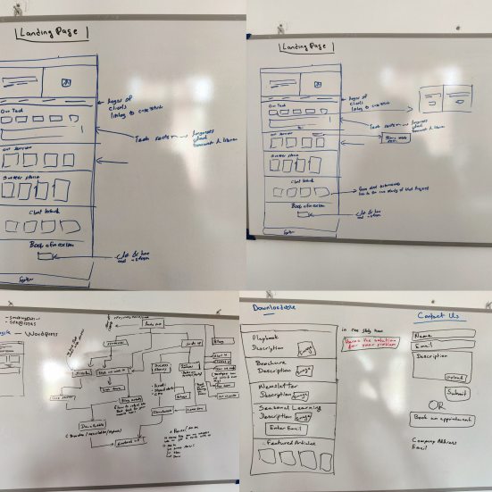
Whiteboard sessions to plan the site map and information architecture.
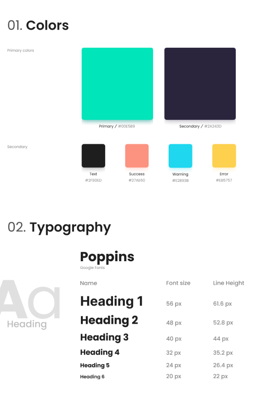
Style guide setup.
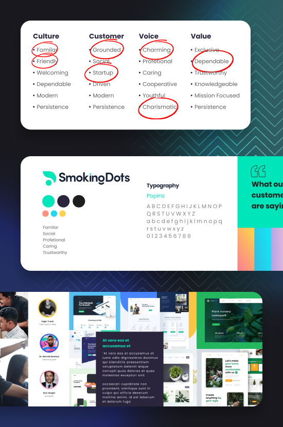
Stylescape setup for the brand.
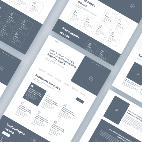
Wireframe sessions to define the website.
Finishing up
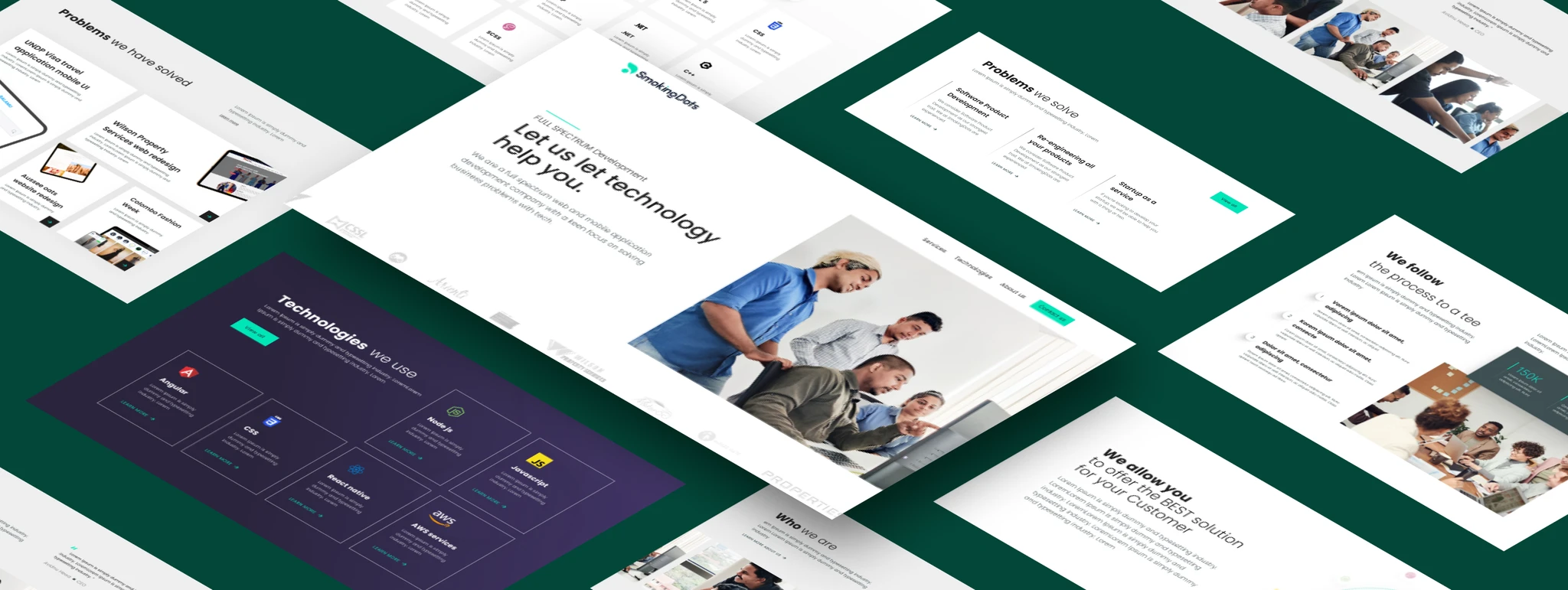
Visual design
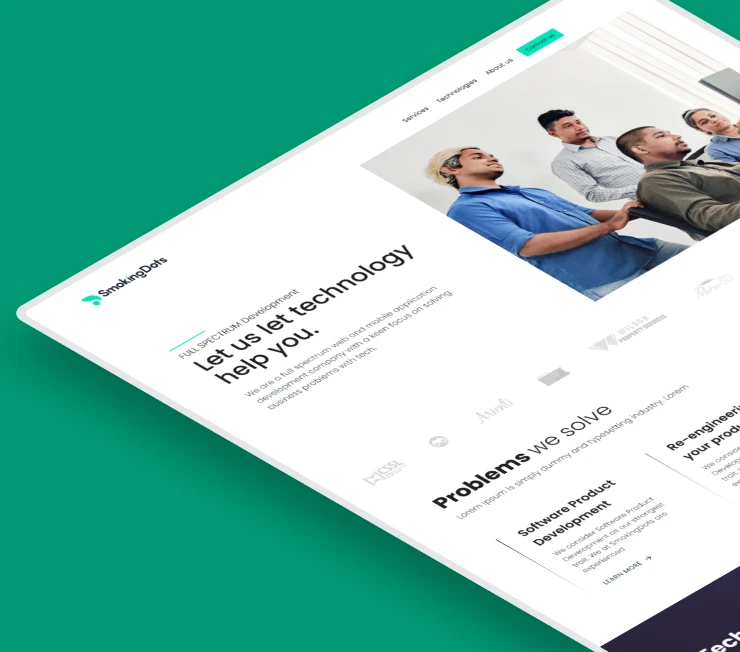
From the workshops with the client the user personas, information architecture, wireframes and site map visual designs were created — starting from the home page to set the whole site look and feel, then moving down to all other pages.
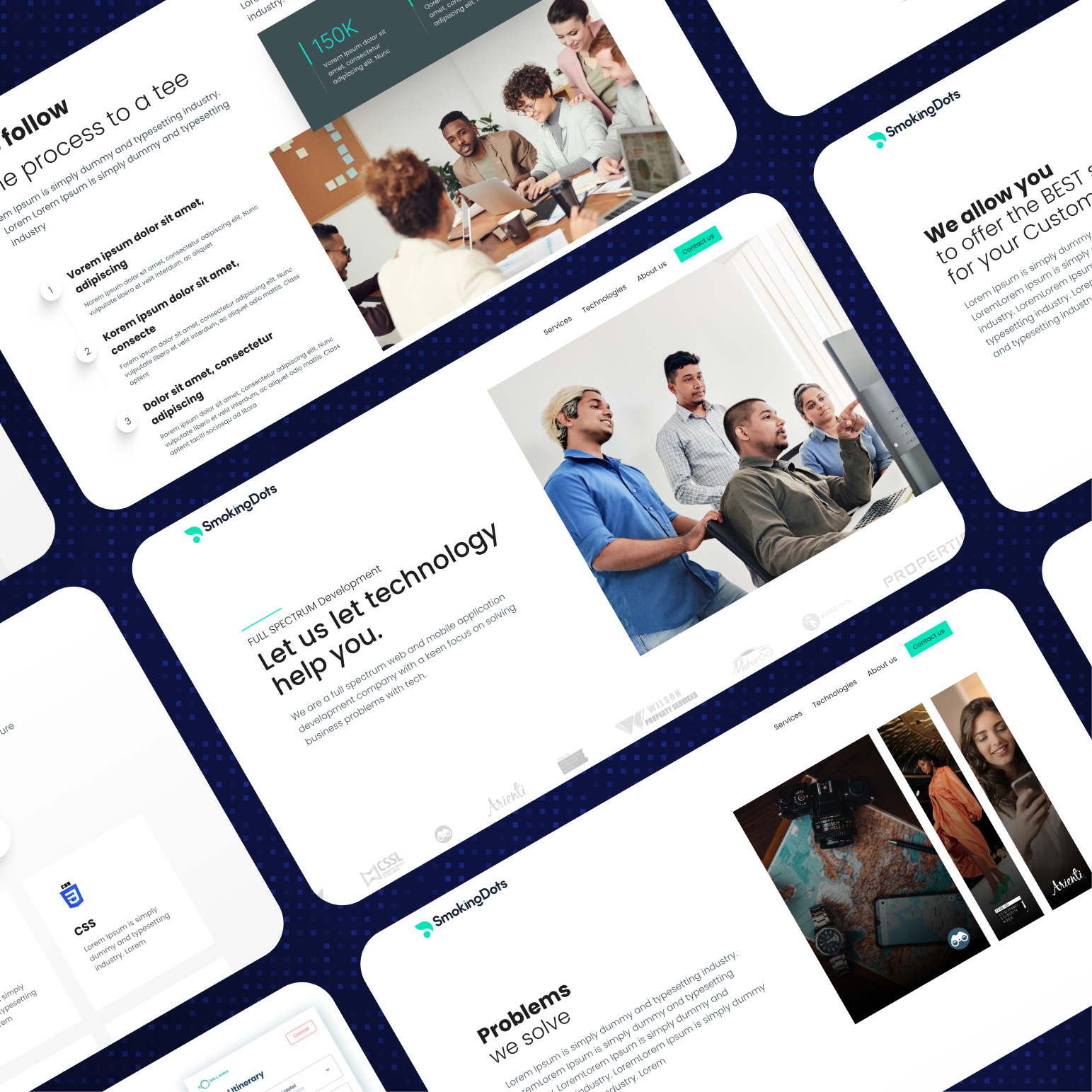
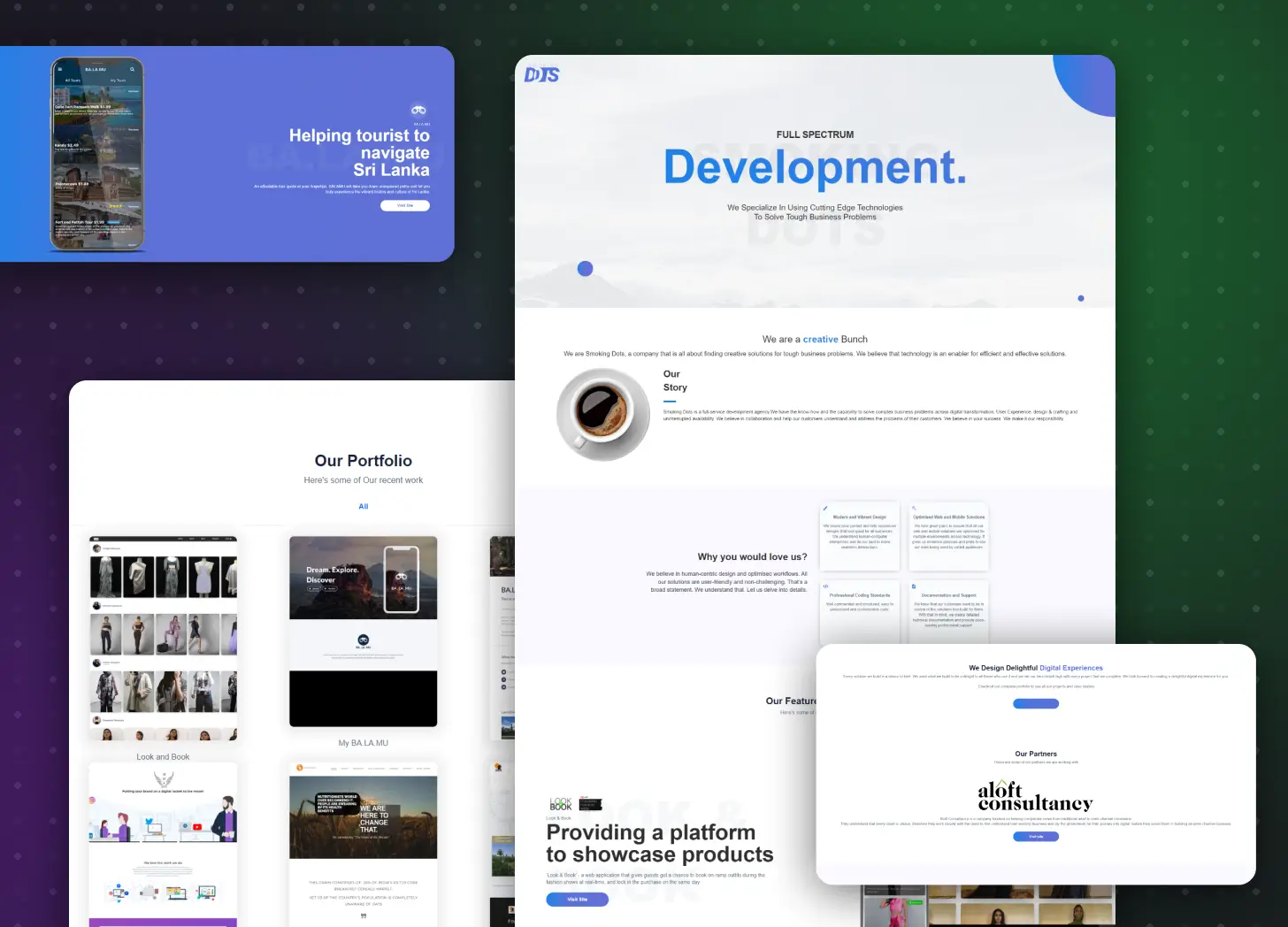
Home page setup to showcase the team.
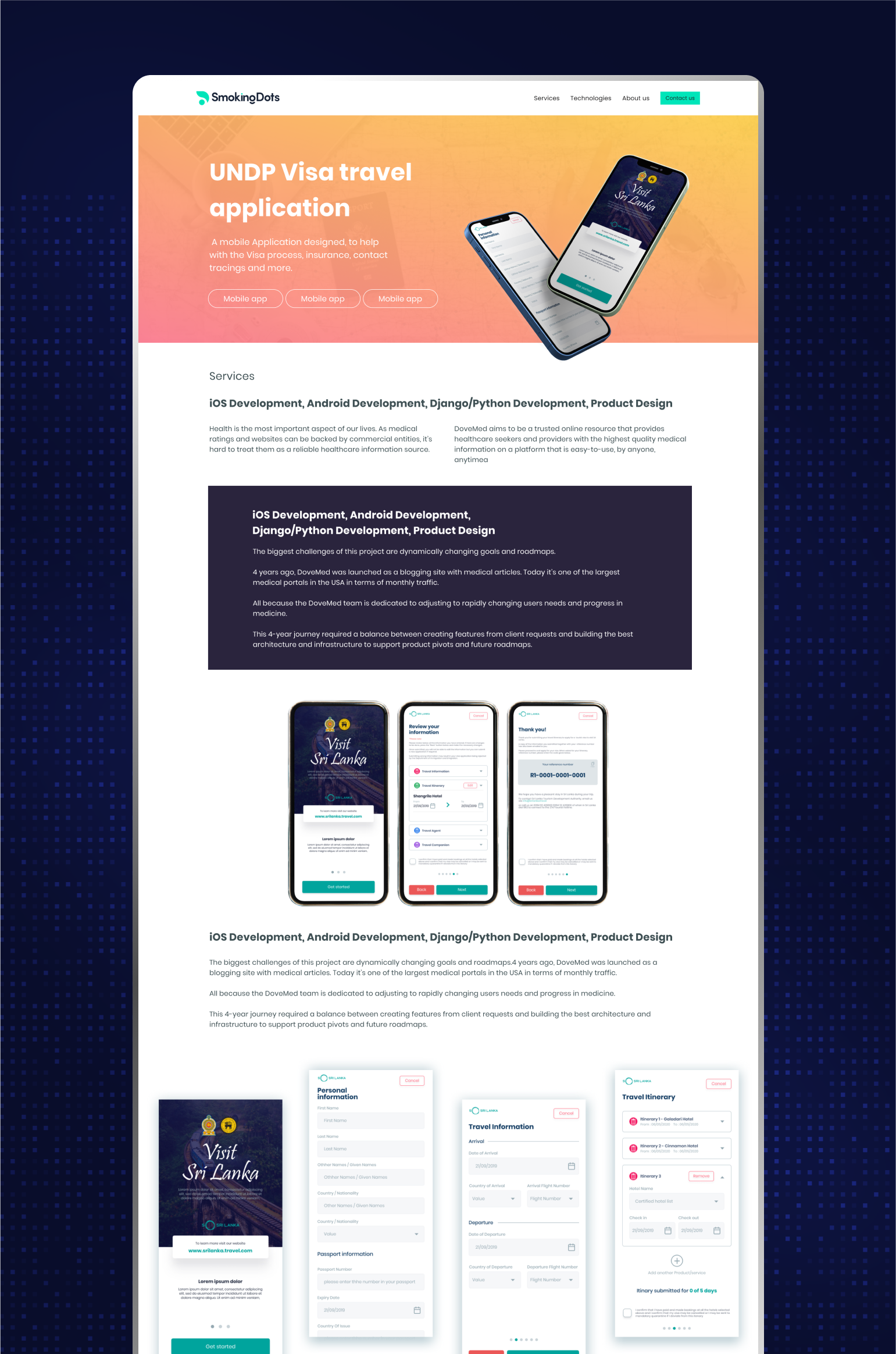
Present project case studies in a way that new clients want to hire the team.
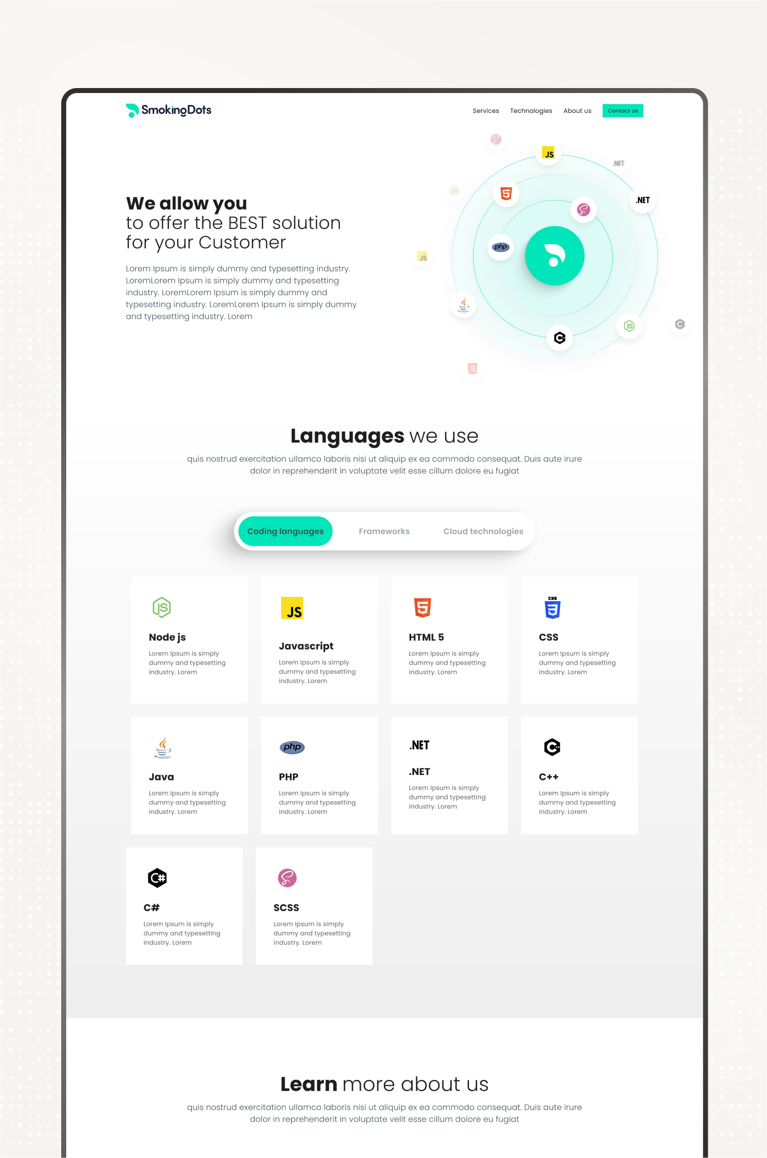
Show all the technologies the company is using.
Present the case studies on the homepage in an attractive way.
Project outcome
Being closely involved with upper management, the marketing team, and the developers allowed me to navigate the project smoothly.
The rebranding was a success, solving the issues the company faced with their old logo. The SmokingDots team could easily use the new logo across all marketing materials and presentations without any hassle.
The new website design gave the company a more professional and trustworthy look, helping them attract both new talent and clients. It also made marketing efforts much more effective and easier for the team to manage.