Reducing the Number of Clicks to Improve Task Completion
*Click any image to quickly cycle through
Summary
Restorize is an All-In-One Toolkit for Restorations Businesses. Restorize lets you track jobs, generate photo reports, manage documentation, schedule tasks, and much more, all in one user-friendly application. Developed in partnership with a leading Australian restoration company, with the primary goal of making sure that running a restoration business is as simple and painless as possible.
Problem
In the mobile view of the Reztorize web application, there were three identical menus that users had to toggle through just to submit pictures for a job. This setup wasn't the friendliest, especially for users who aren't super familiar with web applications.
The problem? It made things a bit too complicated. More menus meant more clicks, and that increased the time it took for users to get the job done. Not ideal.
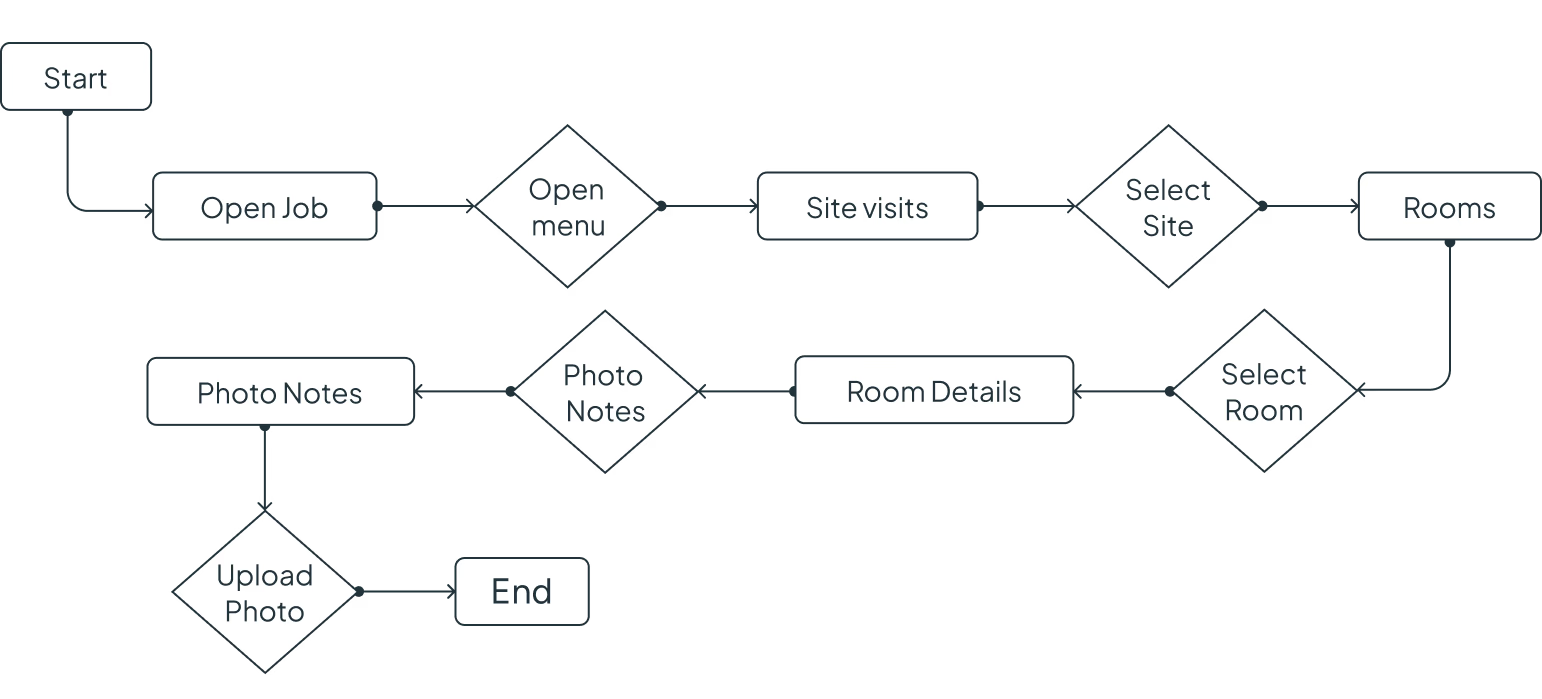
Current Flow
The flow of the photo upload action is not something that can be altered — I had to make sure I keep the current flow intact in order to make sure the web flow is not altered. Minimal UI changes were the main changes that are feasible with the timeline and the scope.
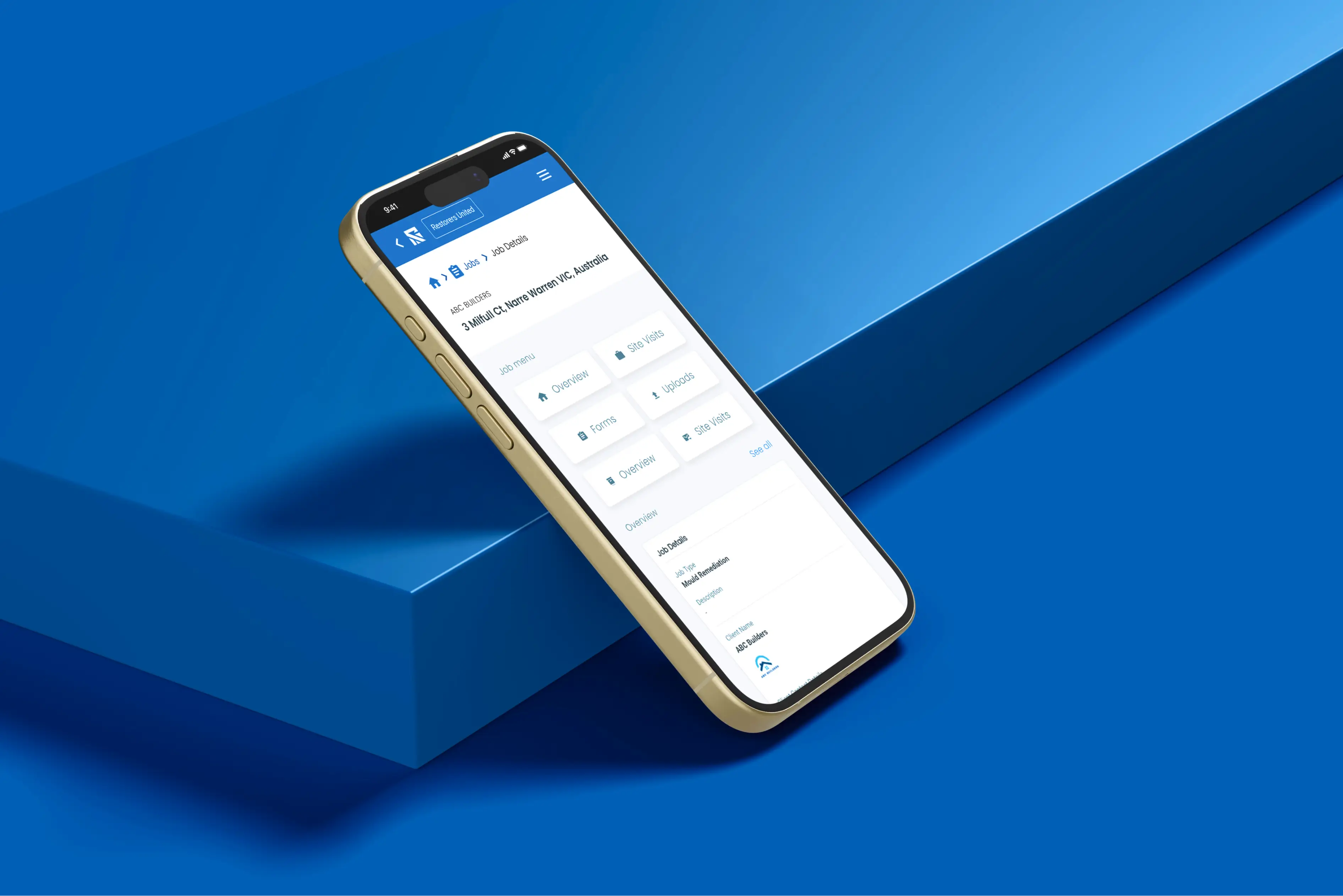
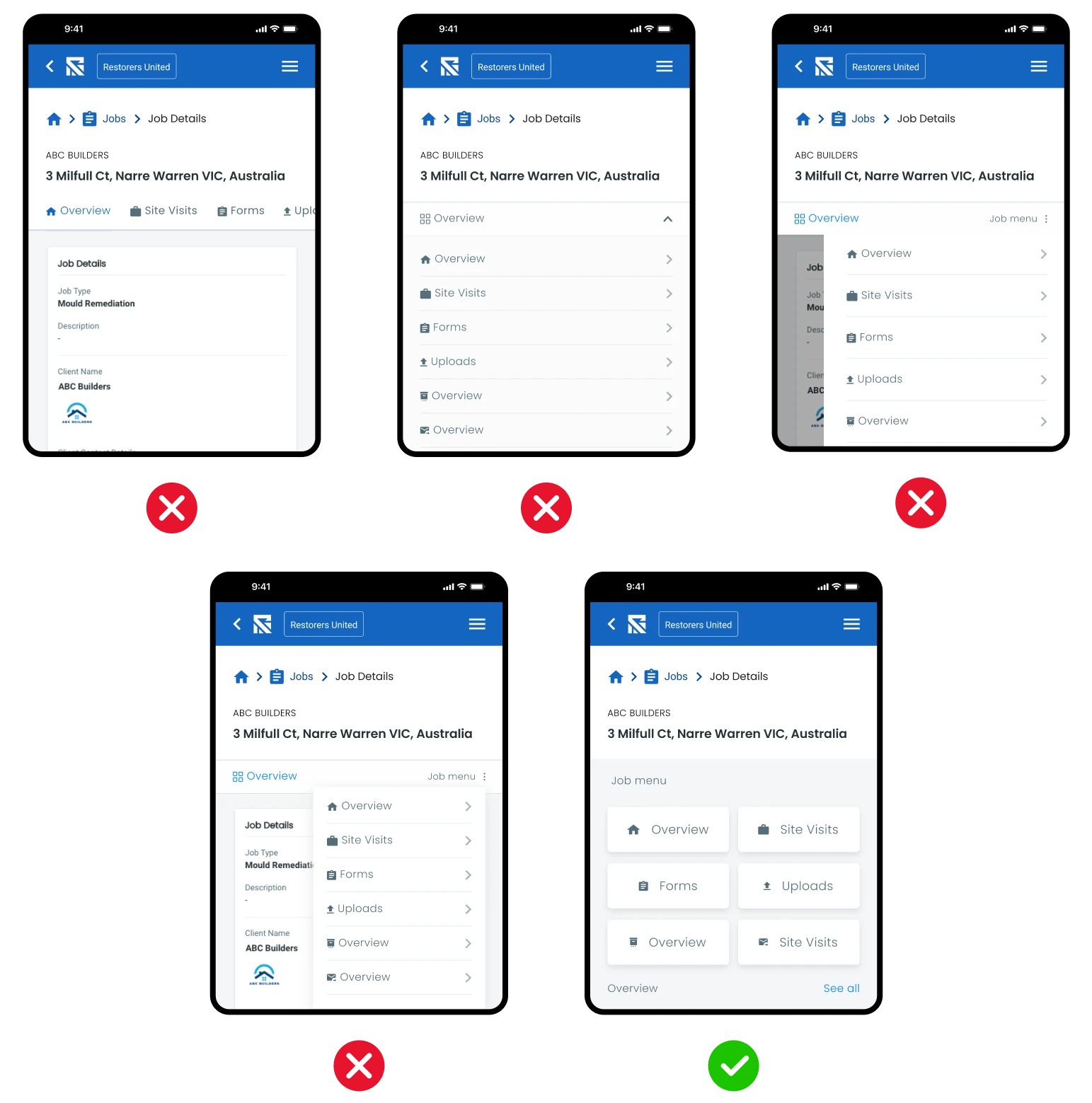
Current Issue Visually
As shown below there are multiple menus that need to be open in order to achieve one action.
Having 3 menus in the same screen that perform completely three different actions will confuse the user. Especially with users now being used to common user patterns, something out of the common patterns will increase the time for the action.
Expected outcome
- Improve the menu usage without changing the application flow.
- Focus on usability.
- Reduce the number of clicks needed to perform the action.
- Use elements and components that are already available in the application to reduce the time that will take to implement, and to ensure cohesion with the rest of the application.
- Simplify the user flow.
Solution Exploration
Menu Explorations
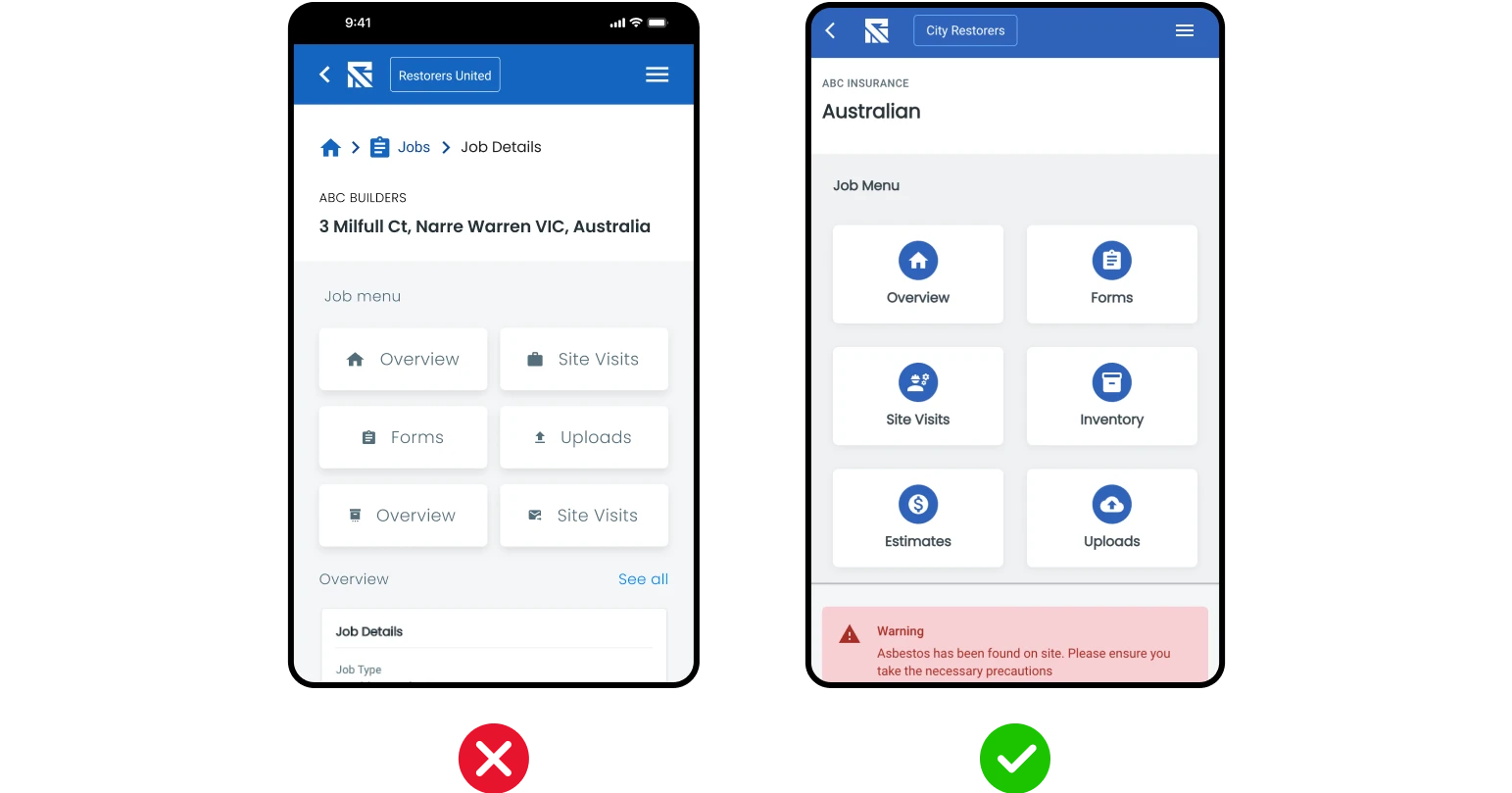
The first thing I did was to reimagine the menu format in order to create a better look and feel. I created 5 options ranging from minor improvements to the existing to more drastic changes.
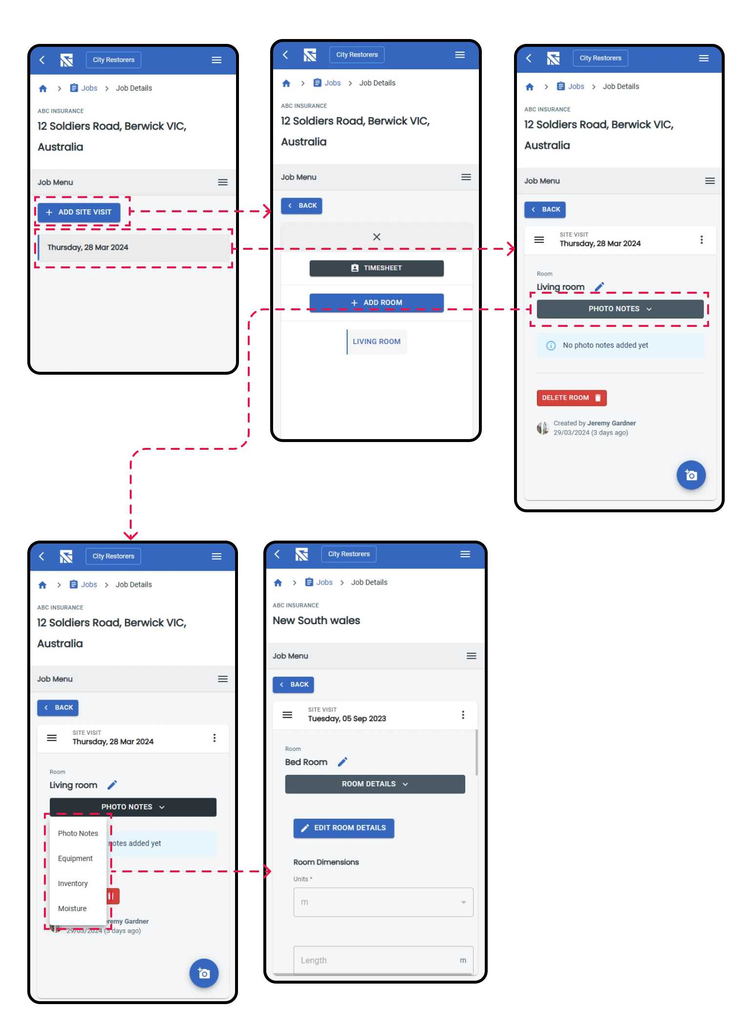
From the selected screen we made one more alt to match the existing menu itself — removing the extra menu icon and functionality — so the flow is simpler.
Room Selection
In the current flow as the user opens up the room it shows in the same menu section. This adds another menu icon and the space to showcase the information is really small. To fix this we moved the room to a completely different page with a back button to quickly return to menu.
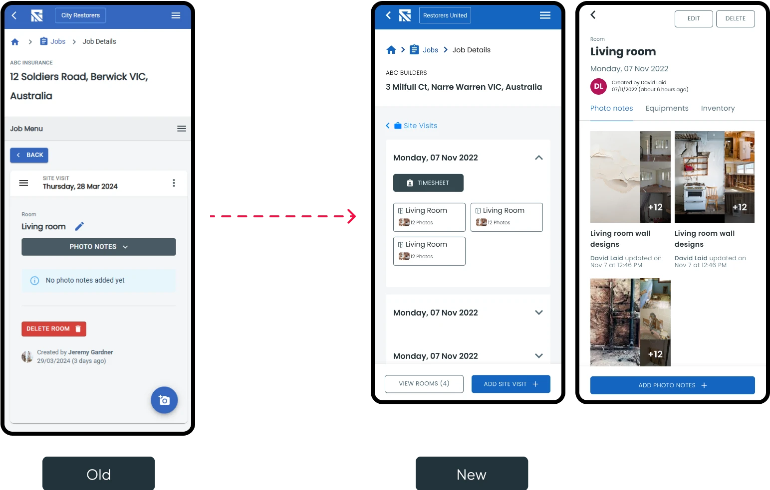
New Flow Up to Photo Upload
Keeping the same modules that are already coded we found a direction that solves the user pain points effectively.
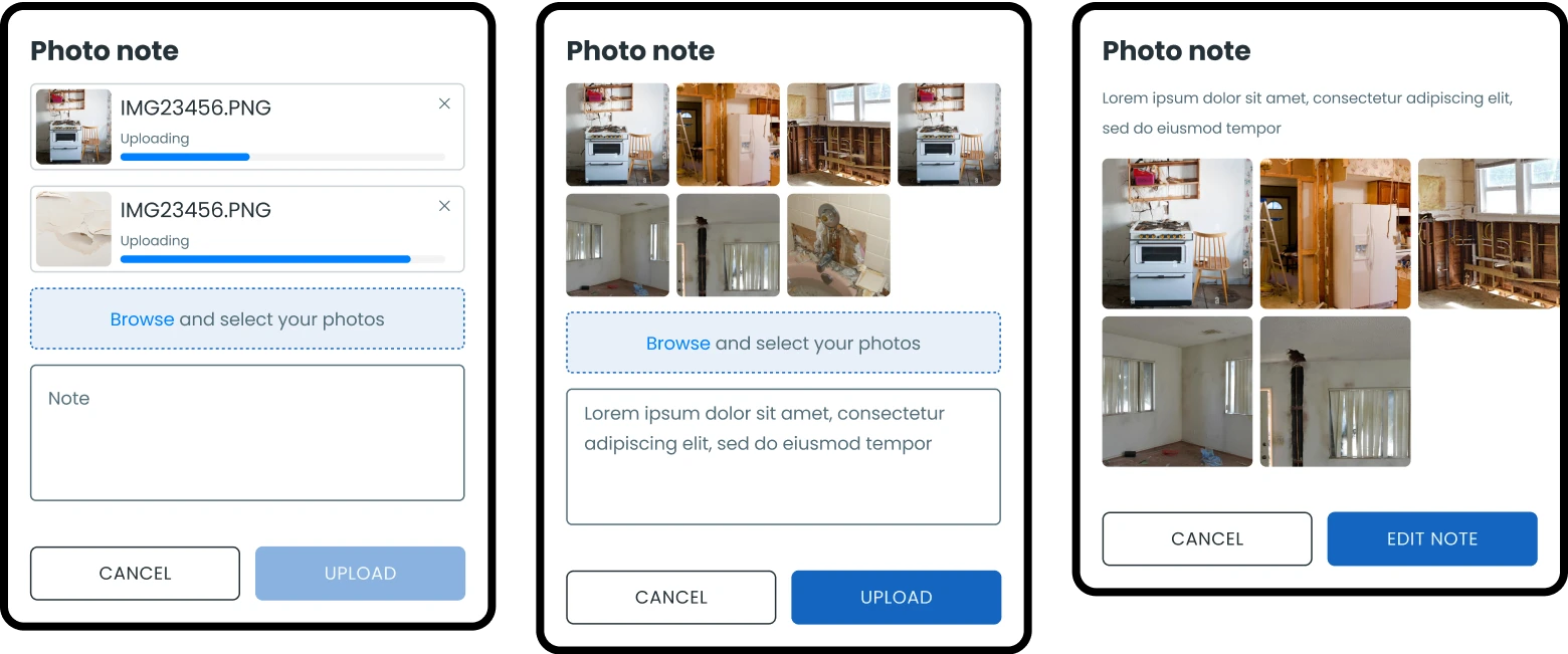
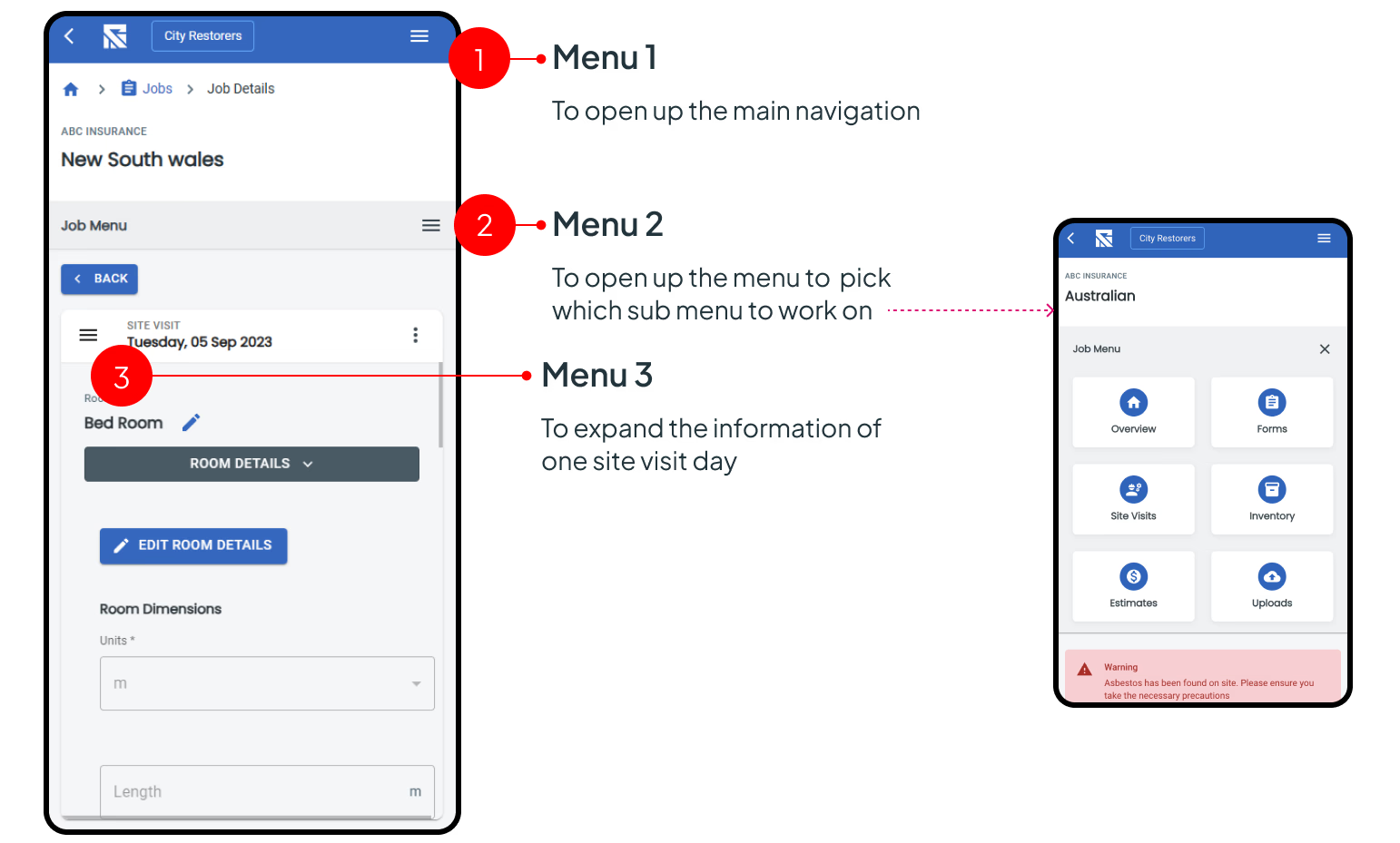
Flow Exploration
With the base components agreed upon I created the main journey to move to testing.
Result
- Improve the menu usage without changing the application flow.
- Focus on usability.
- Reduce the number of clicks needed to perform the action.
- Use elements and components that are already available in the application to reduce the time that will take to implement, and to ensure cohesion with the rest of the application.
- Simplify the user flow.
Project Outcome
At the end of the project we managed to create two main flows with the new and simpler menu structure. The Restorize team will be able to use the simpler flow that can be implemented quickly and shipped out, and the more optimised flow will be used as a further improvement down the line.
The flow that was created with this exercise was also used when we moved into converting the web application into a mobile application.
Overall it was a great experience running through multiple variations to improve this very specific section of the existing application.