Rapid Design of a Product
*Click any image to quickly cycle through
Summary
Noshing is an application made to connect foodies and home cooks. Having done the initial research on the validity of the product, the Noshing team wanted to GTM quickly. I was brought on to work on the UX and the visual designs.
Because of the tight deadline, I worked closely with the leadership team and the development team to make sure we work in parallel to get things done smoothly.
Planning
Even though this application shares things in common with other food applications, the team did not want to create another “restaurant app”. This application is more focused on connecting foodies with experiences, and giving home cooks a chance to earn money and host interesting people.
Few decisions made to support that goal,
- A home cook can host up to 5 guests at a time.
- Home cooks decide who they welcome into their home, and they're given access to each foodie's full profile to help them decide.
- Foodies can only bring friends to meals that are already listed on their profile.
- Home cooks can plan meal availability and block off days they're unavailable, so foodies can't request meals on those dates.
The two main users
- Foodie → Users that are interested in enjoying food
- Home Cook → Users that enjoy cooking and hosting foodies
Exploring Feature vs. Time
For fast-paced projects, smart time management is a must—I didn't want to spend too much time on small features or rush the important ones. So, I created a decision matrix to stay on track. Instead of following the full design process for everything, I broke it down by features and chose the best approach for each feature.
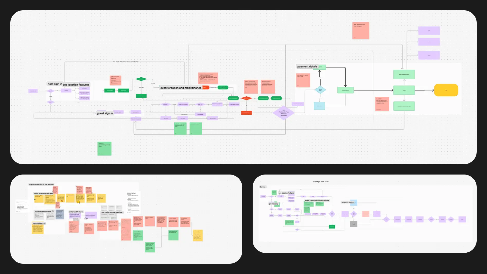
User Journey
I created the complete user journey for both type of users at once, this helped to breakdown all the features that were needed.
Feature Decision Matrix
By mapping each feature based on clarity and complexity I was able to decide which features need more attention and which features can go into design immediately, and hand them over to the developers to be implemented.
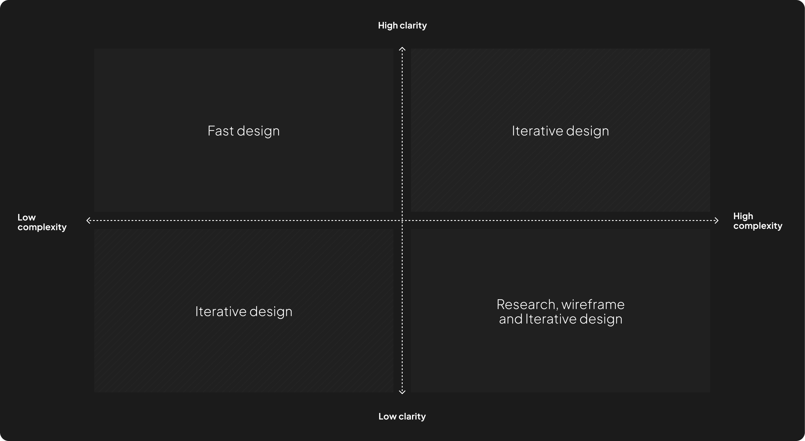
For example:
The registration flow is simple and clear, so we can move straight to design (low complexity and high clarity).
On the other hand, the meal preparation flow is more complex and unclear due to many variables. Because of this, I started with research, then created wireframes and tested different variations before finalizing the design (high complexity and low clarity).
Feature Originality
With tight deadlines, I needed to balance originality and efficiency—avoiding full copies while not reinventing the wheel. By considering each feature's importance and how well-established it was, I chose the best approach for each one.
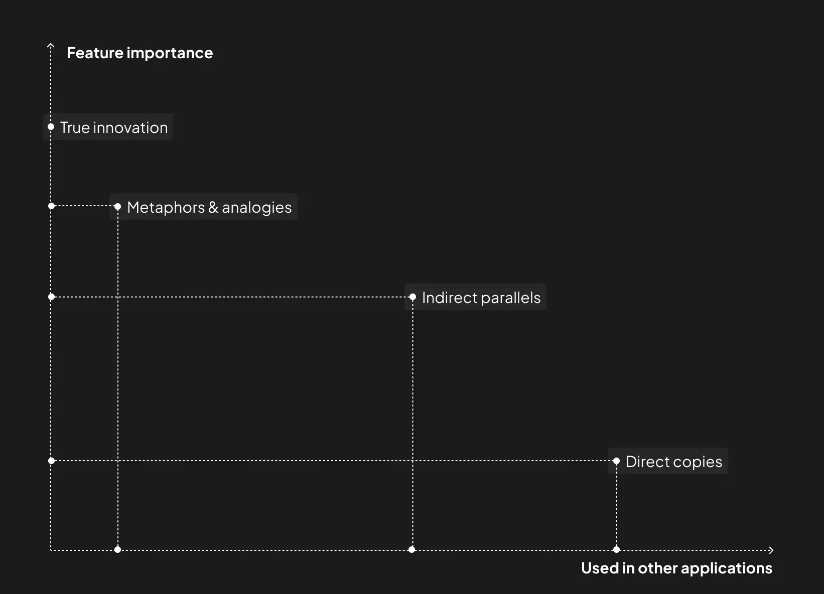
I chose the best way forward by following a simple approach:
- Direct copies → Using the same flow as existing applications.
- Remixes → Mixing ideas from different sources to create a flow.
- Indirect parallels → Borrowing ideas from other industries that solve similar problems.
- Metaphors & analogies → Using real-world concepts to shape the design.
- True innovation → Creating something completely new from scratch.
For example:
Uploading a recipe is a feature that is important and it's an established feature in many applications already (low importance and well-established).
On the other hand, reserving a seat with a home cook is a very important feature, and there are a number of applications that uses a similar flow, so we can borrow from them and remix it to match our needs (high importance and well-established).
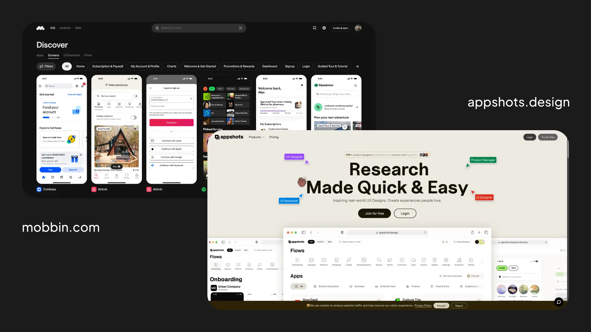
Resources
I used Mobbin and Appshots to research how other applications solve problems. This allowed me to move forward much faster and efficiently.
Application Look & Feel
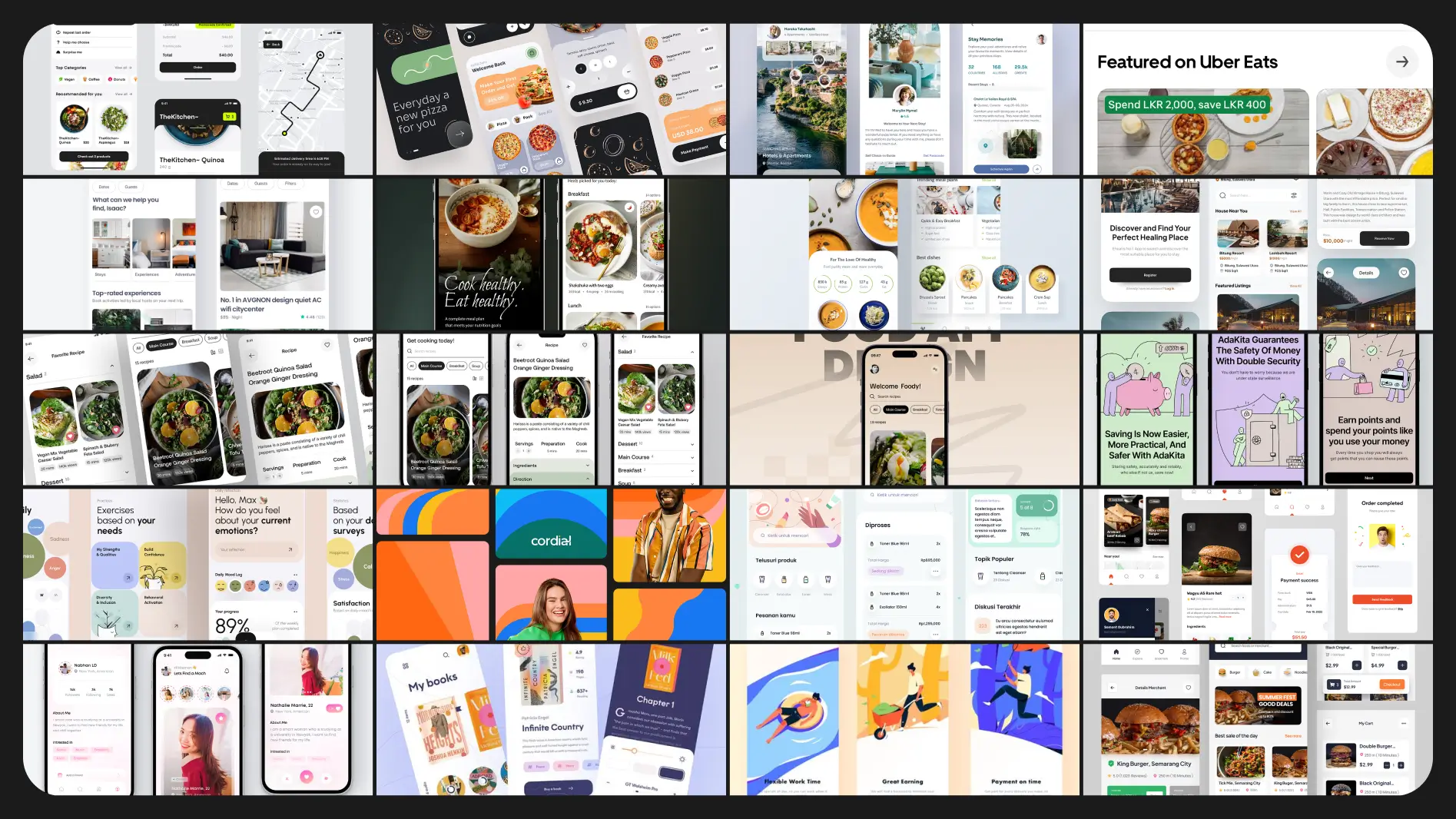
Moodboard
To perfect the look and feel of the app, I went through several mood board sessions with the whole team. This helped lock-in a strong design style.
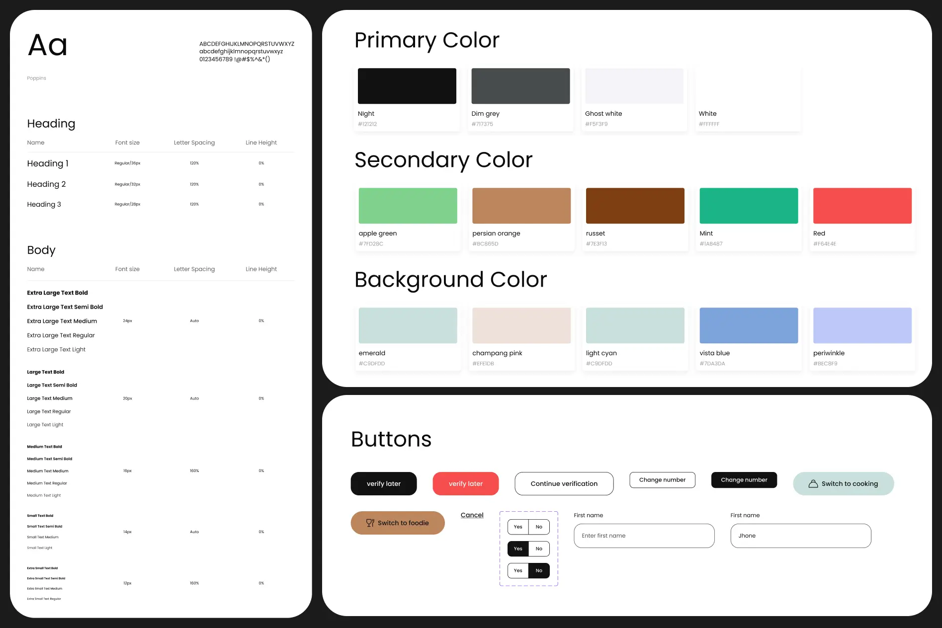
Style Guide
Once the moodboard was finalized, I created a style guide, which naturally evolved into a full design system.
User Interface Design
Visual Design
With insights from the moodboard sessions, style guide, and design system, I moved on to designing and prototyping the app.
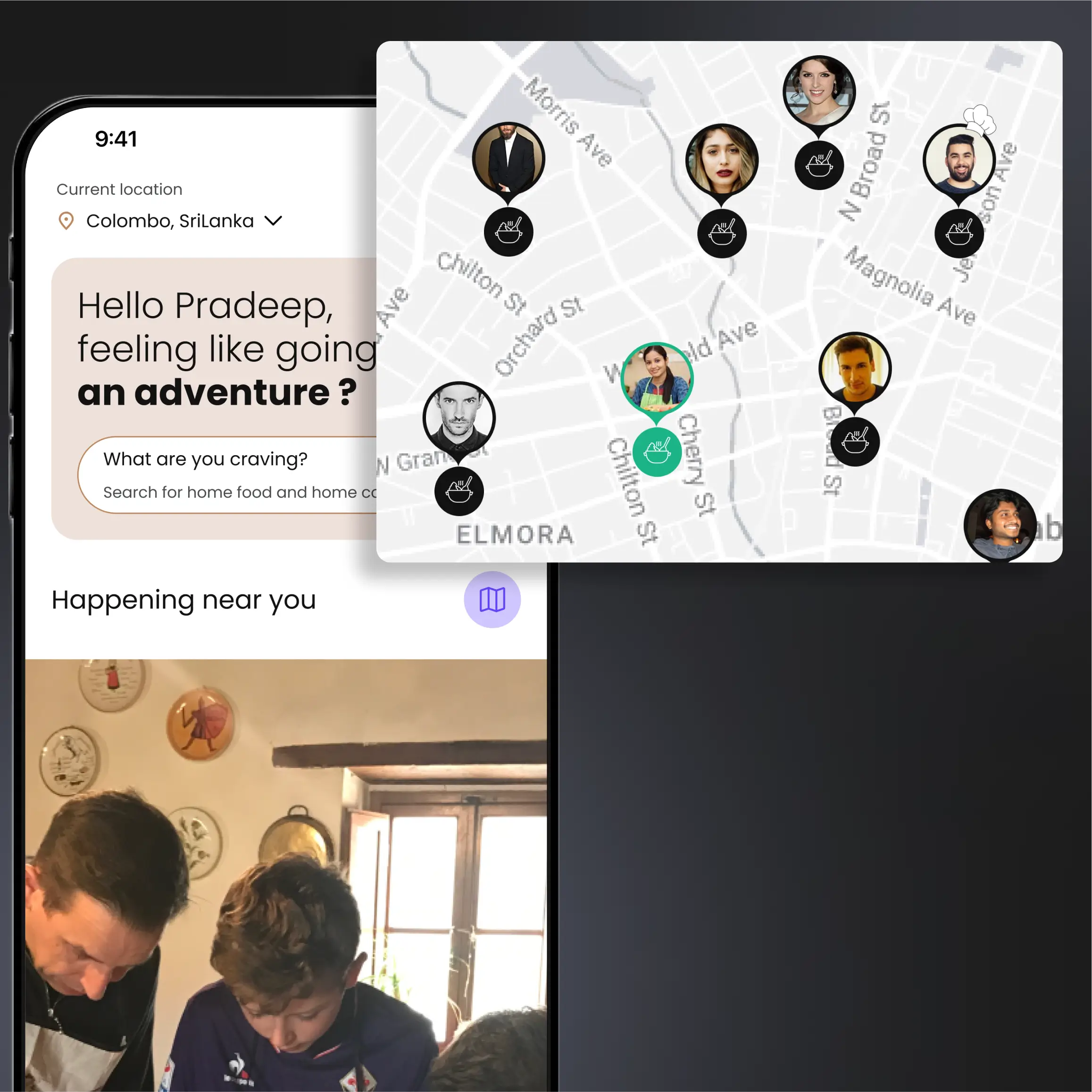
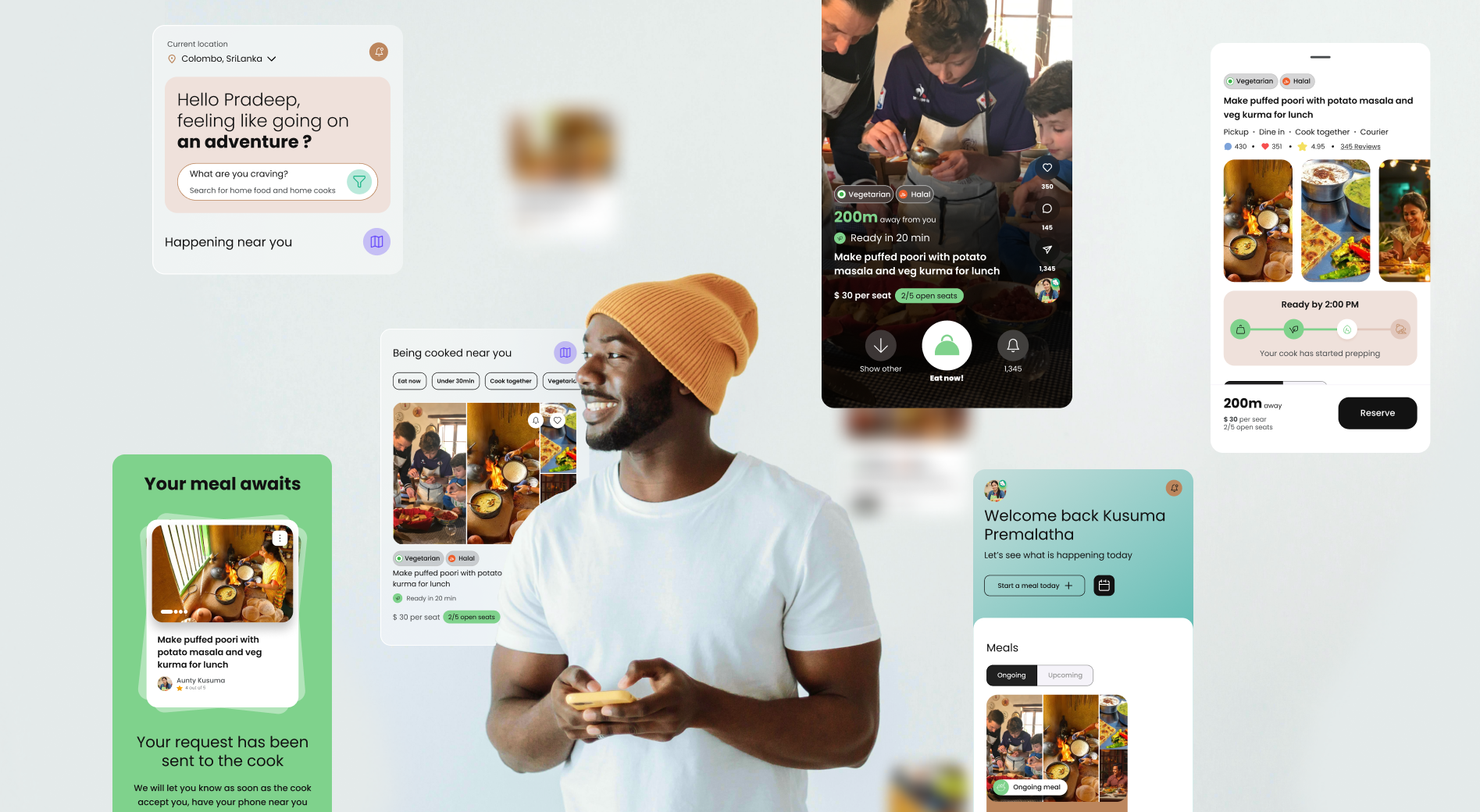
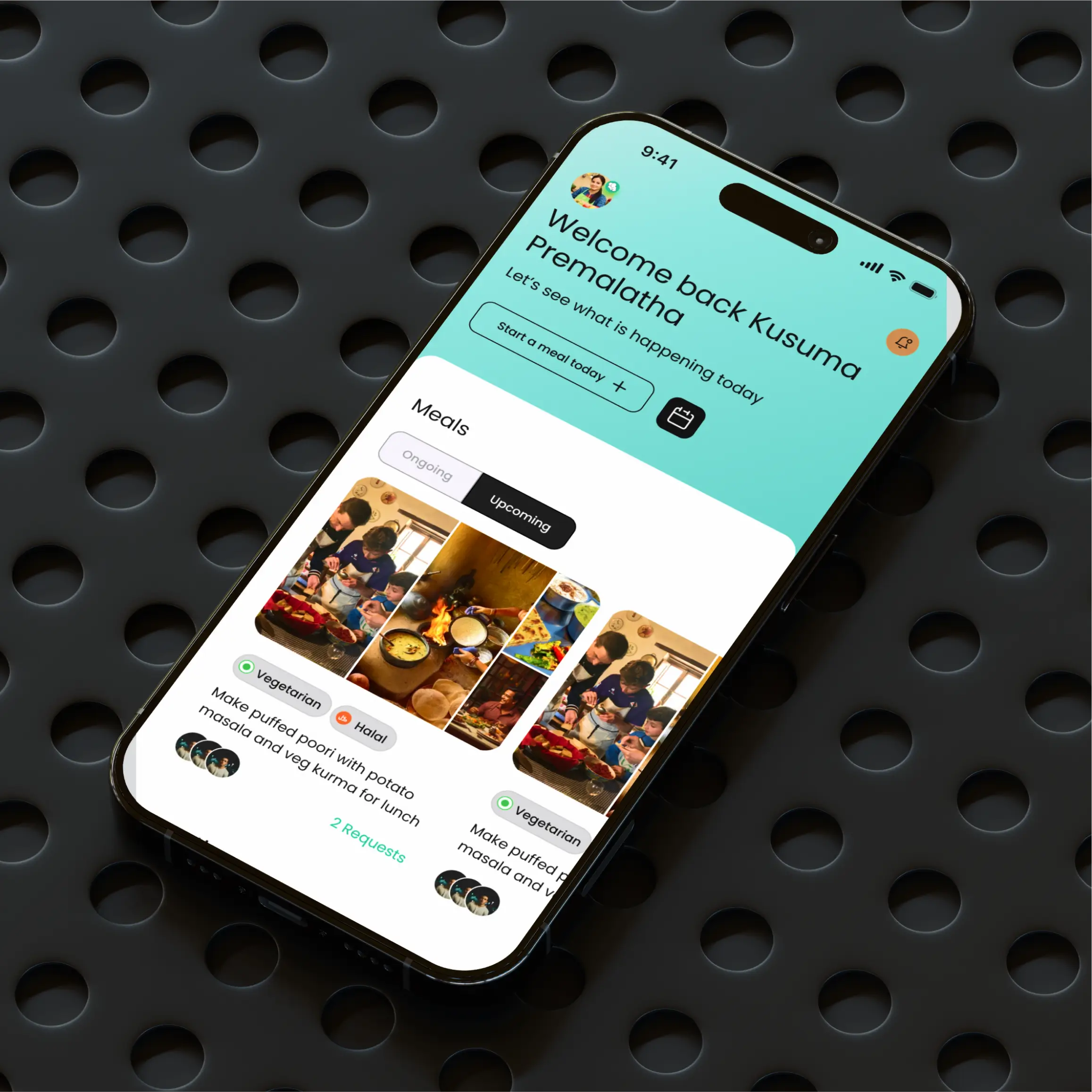
Both a list view and a map view are used to help find home cooks.
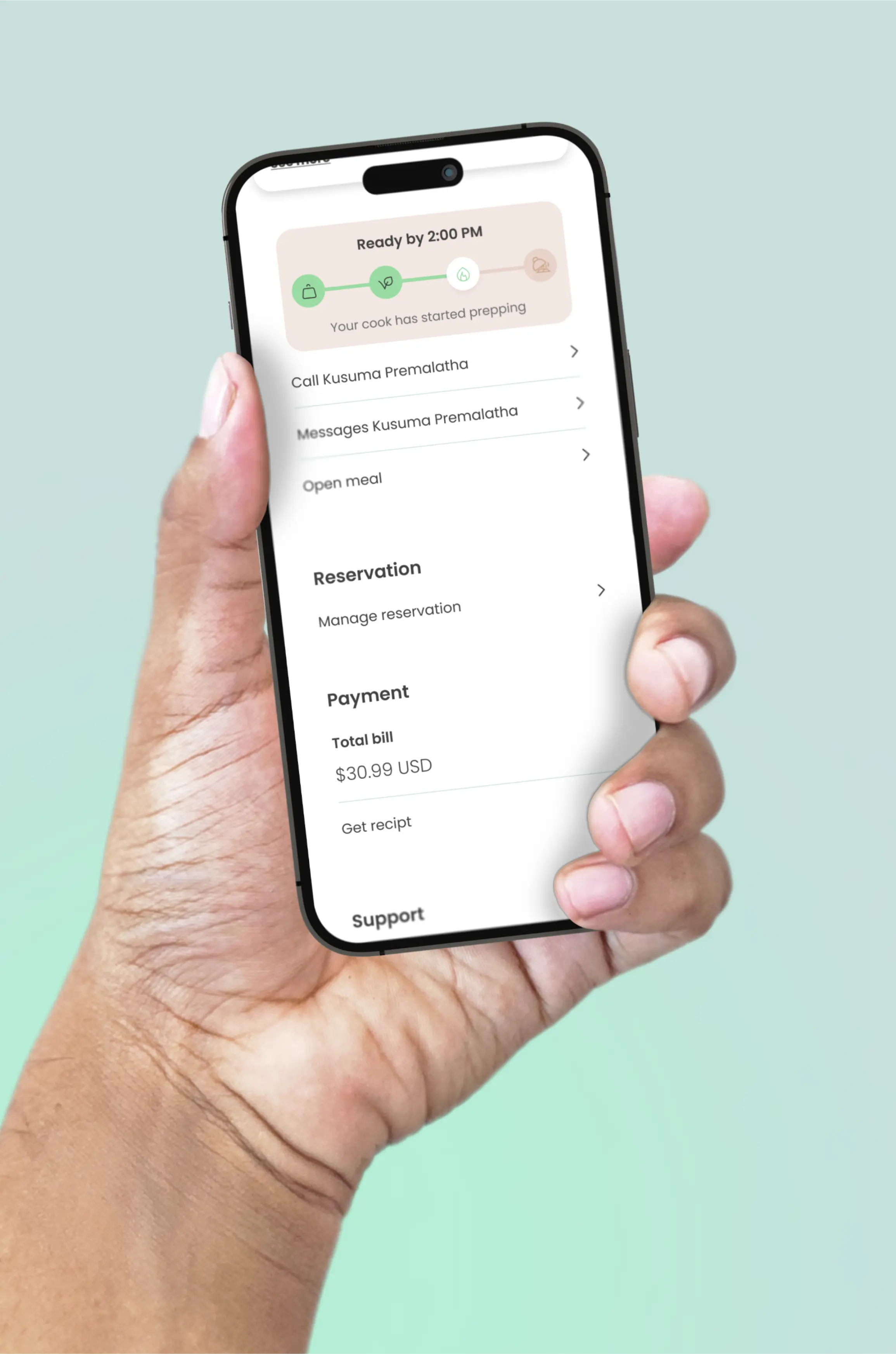
Once a meal is accepted, users are kept informed of the home cook's progress.
For the home cook, information is organized in a clear, logical hierarchy.
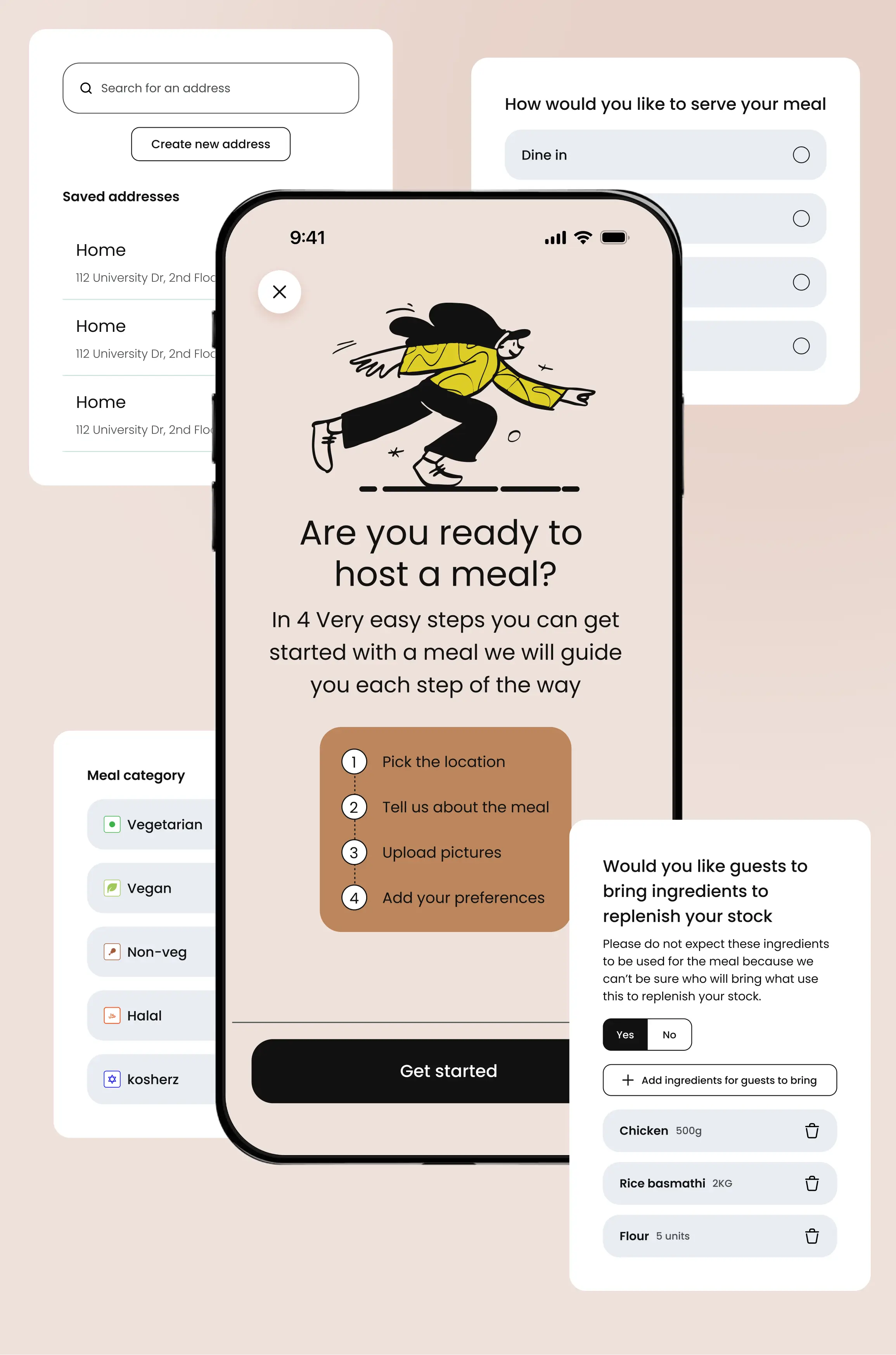
All necessary information was provided to the home cook to plan the meal without overwhelming them.
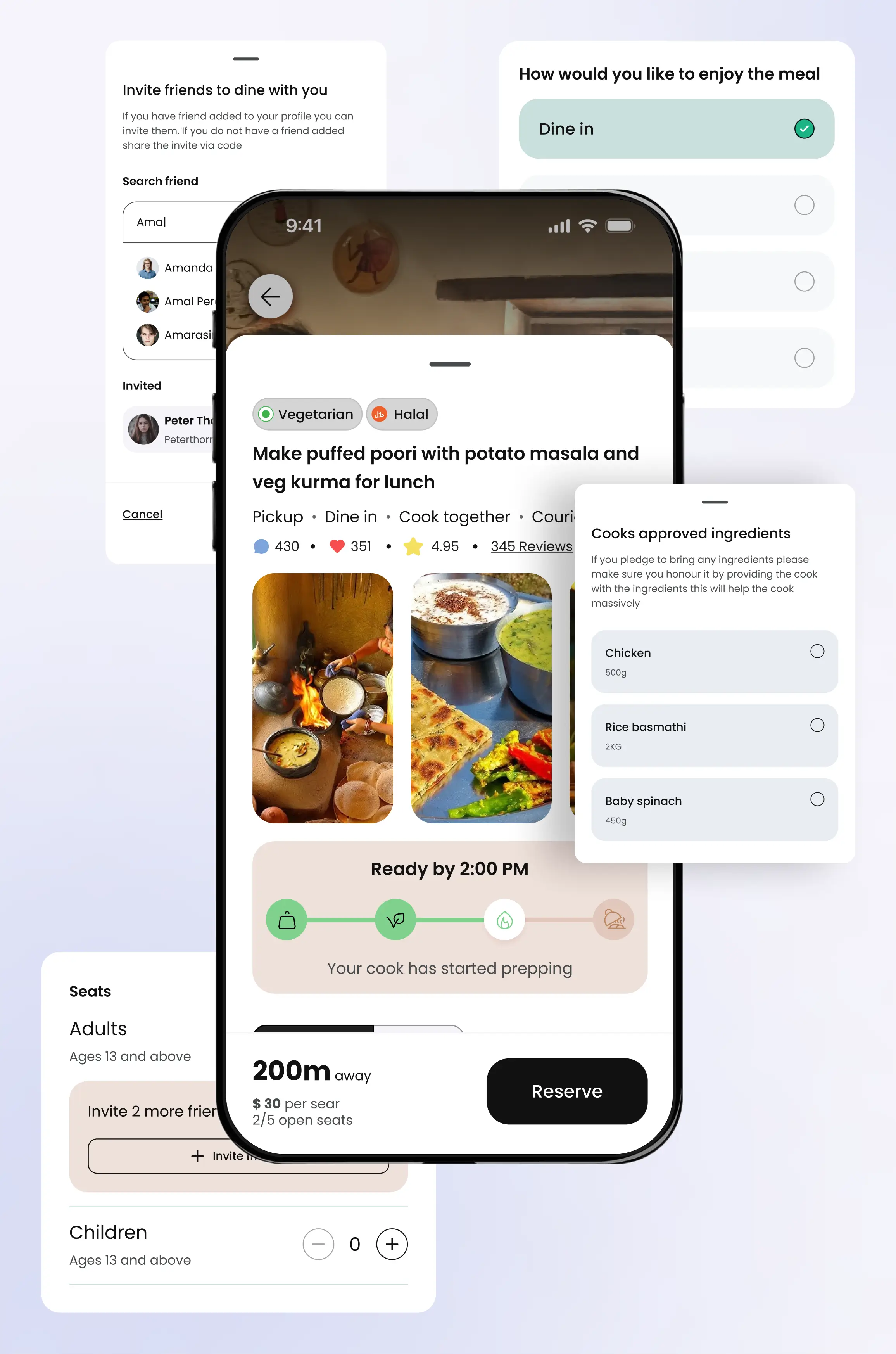
All meal information is presented clearly, enabling foodies to make informed decisions.
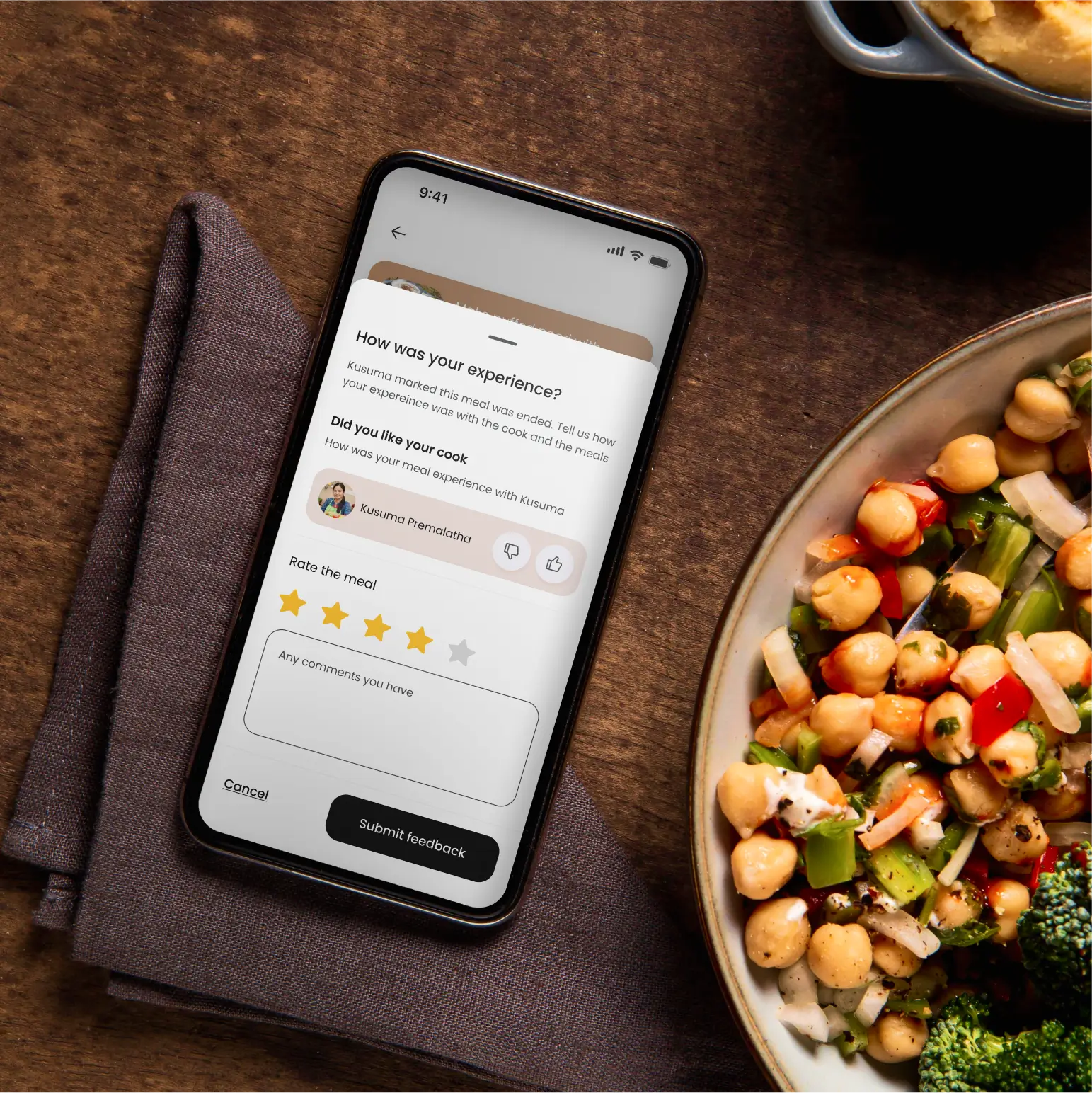
Foodies are given an easy, low-effort way to rate the home cook and the meal separately.
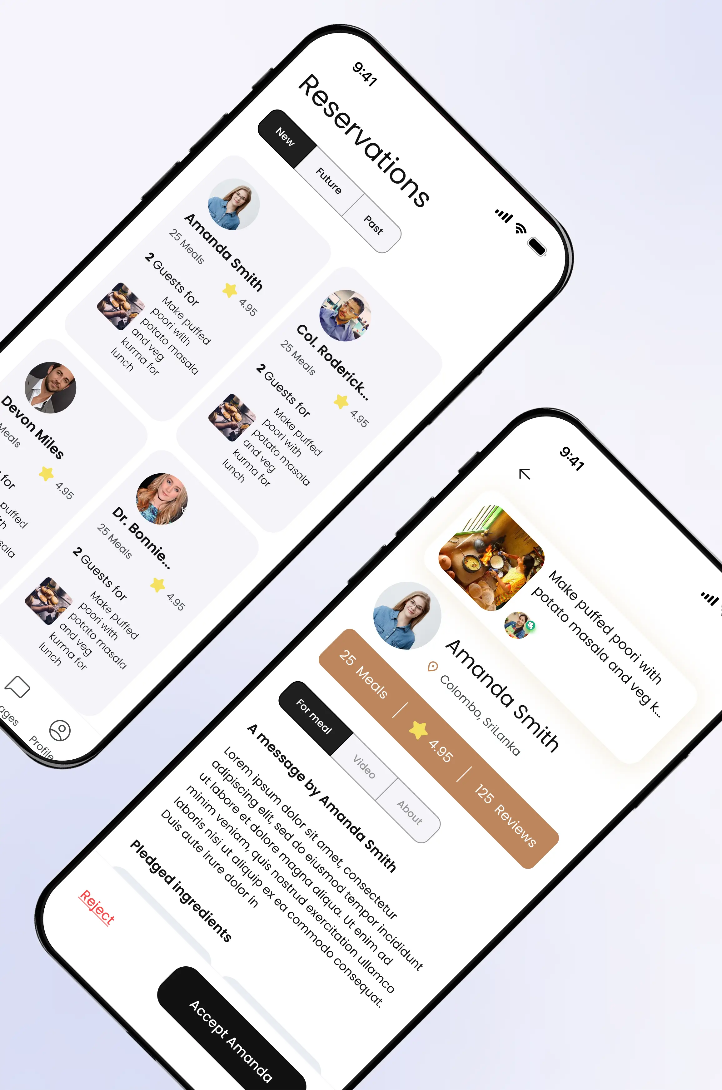
Information about guests is provided to the home cook to support a safe and informed decision-making process.
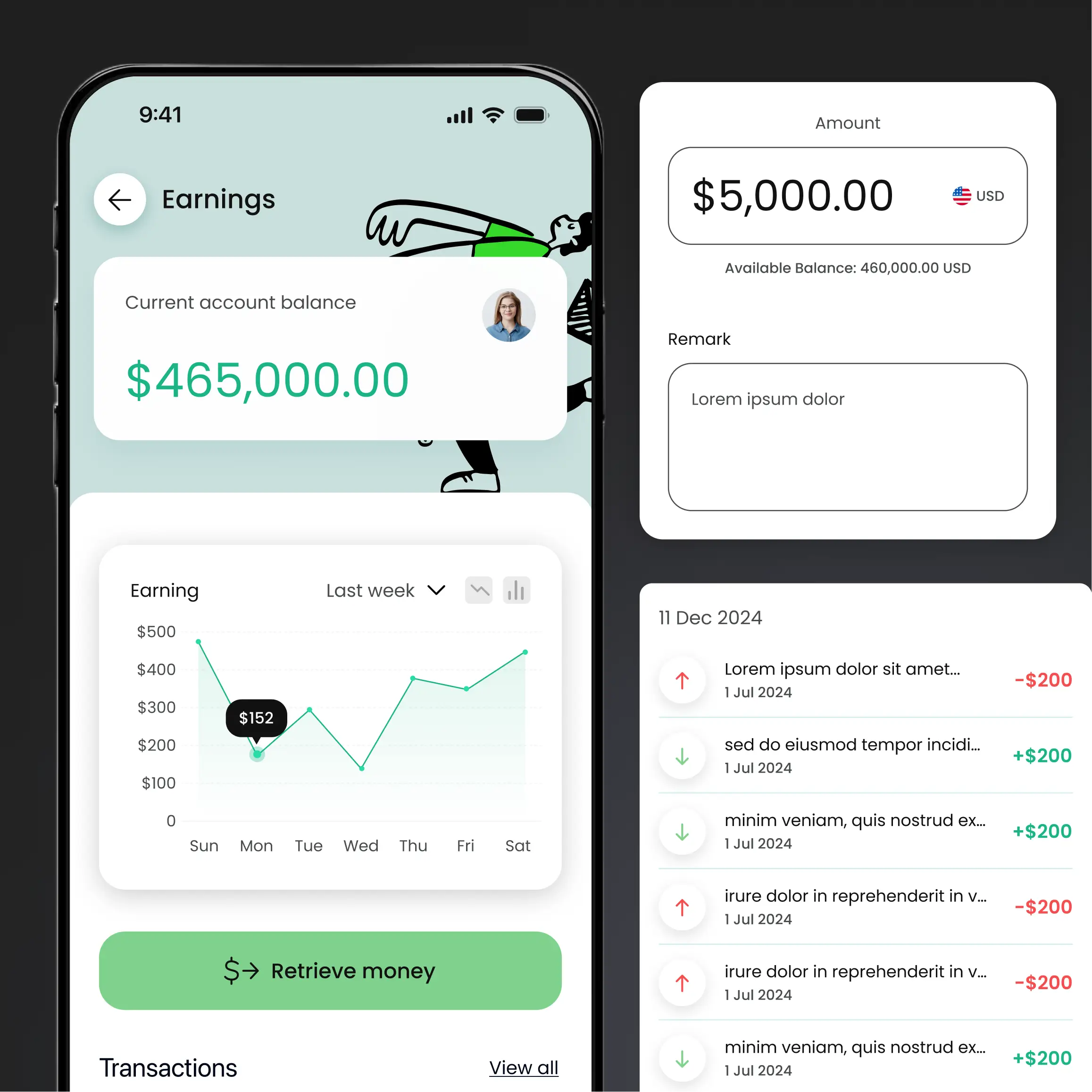
The money is securely held by Noshing and can be retrieved by the home cook in their preferred manner, supporting home cooks in rural areas.