Turning an AI Prototype into a Product That Scales
*Click any image to quickly cycle through
Summary
LocalFlow brings itineraries, routing, costing, quotes, leads, and customers into one place, so tour operators can run their business without living in spreadsheets.
The founders had proven the idea with an AI built prototype, enough to raise funding. I was brought on to turn it into a real product.
The catch: the team are not designers, and new hires were a way off. So whatever I built had to be simple enough for non designers to use and clear enough for AI to extend. The real job was every screen that didn't exist yet, and who would build it.
The Problem
The features were right: a day by day itinerary builder, routing on a map, AI drafts. But it was built one screen at a time, so it behaved like three products stitched together. It demoed well, but it could not grow.
The same issues kept showing up.
Shared containers across states. One container did double duty for different states, so users could not tell where they were.
Inconsistent inputs. Input fields and other components were styled differently everywhere, with no shared pattern.
Buttons with no system. Button styles drifted, and basics like spacing and line breaks were not followed.
Mixed tabs and controls. Several tab styles and control types sat side by side, so nothing behaved predictably.
Tabs inside tabs. Nested tab layers stacked up, which made the app hard to navigate.
Approach: design for the screen that doesn't exist yet
The features were solid, so this was not a redesign. It needed one shared language, so any screen nobody had drawn yet could be assembled from parts that already match.
Build order: raw values first, then parts, then layouts, then screens.
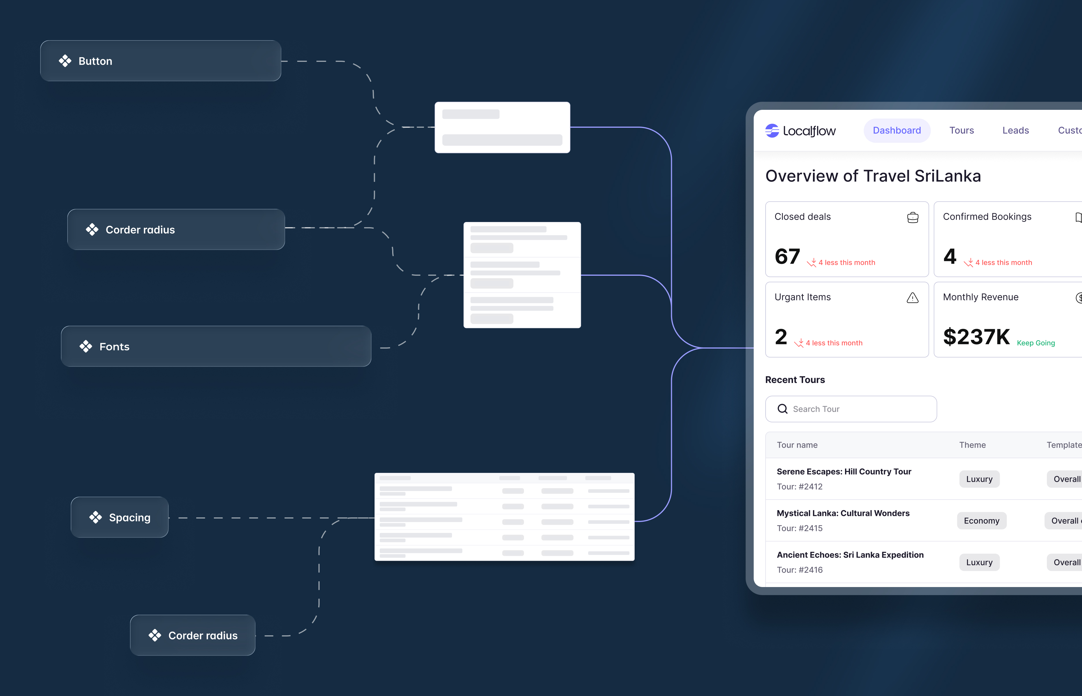
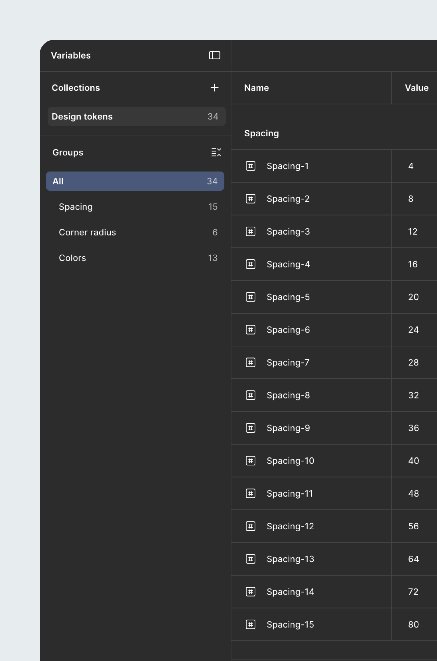
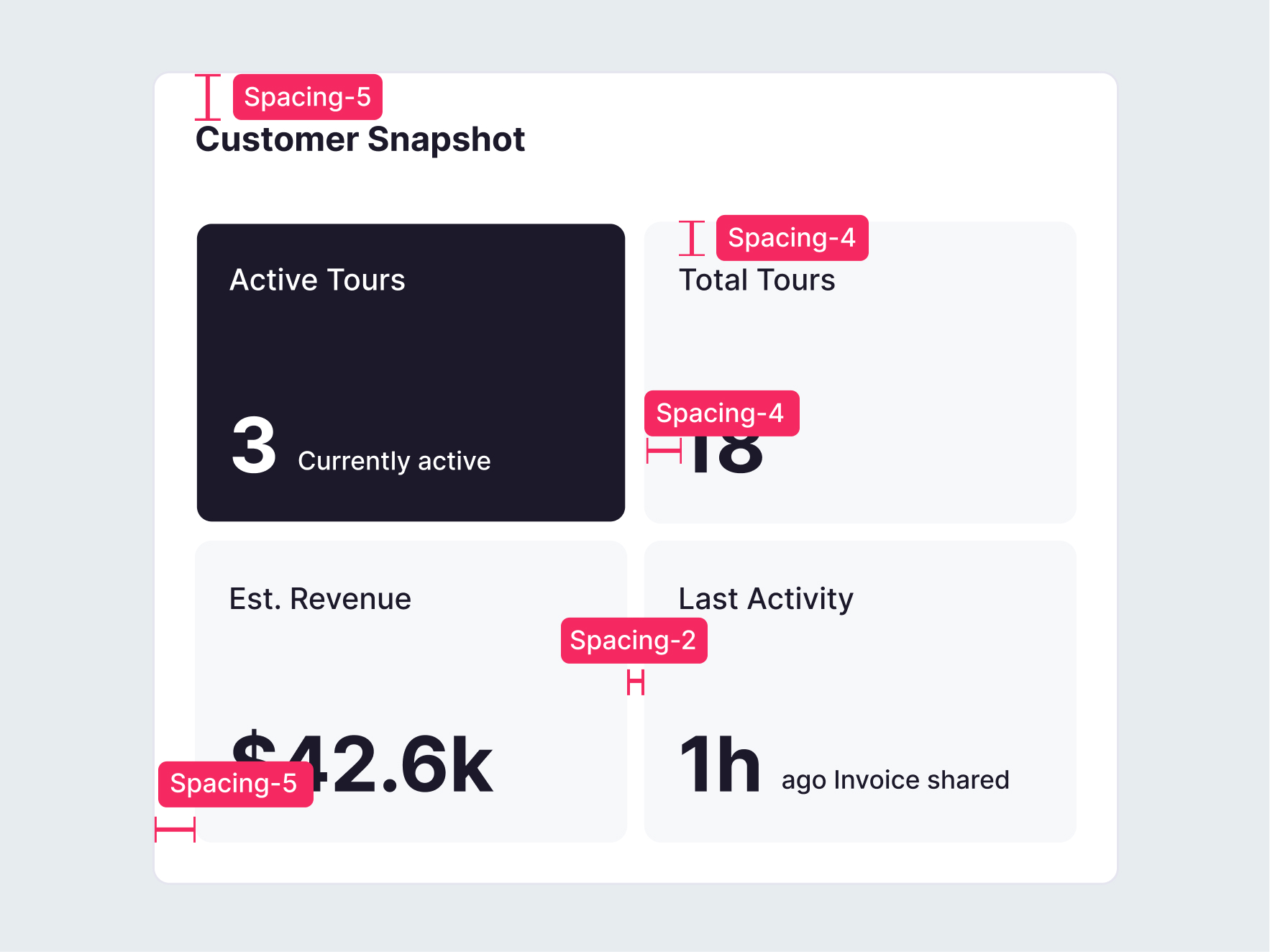
Foundations: tokens
Everything sits on tokens, so each decision has one source of truth.
- Type: an Inter scale from 40px to 12px, bold and medium.
- Spacing: a 4px scale, 15 steps from 4px to 80px.
- Radius: six steps from 4px to 40px.
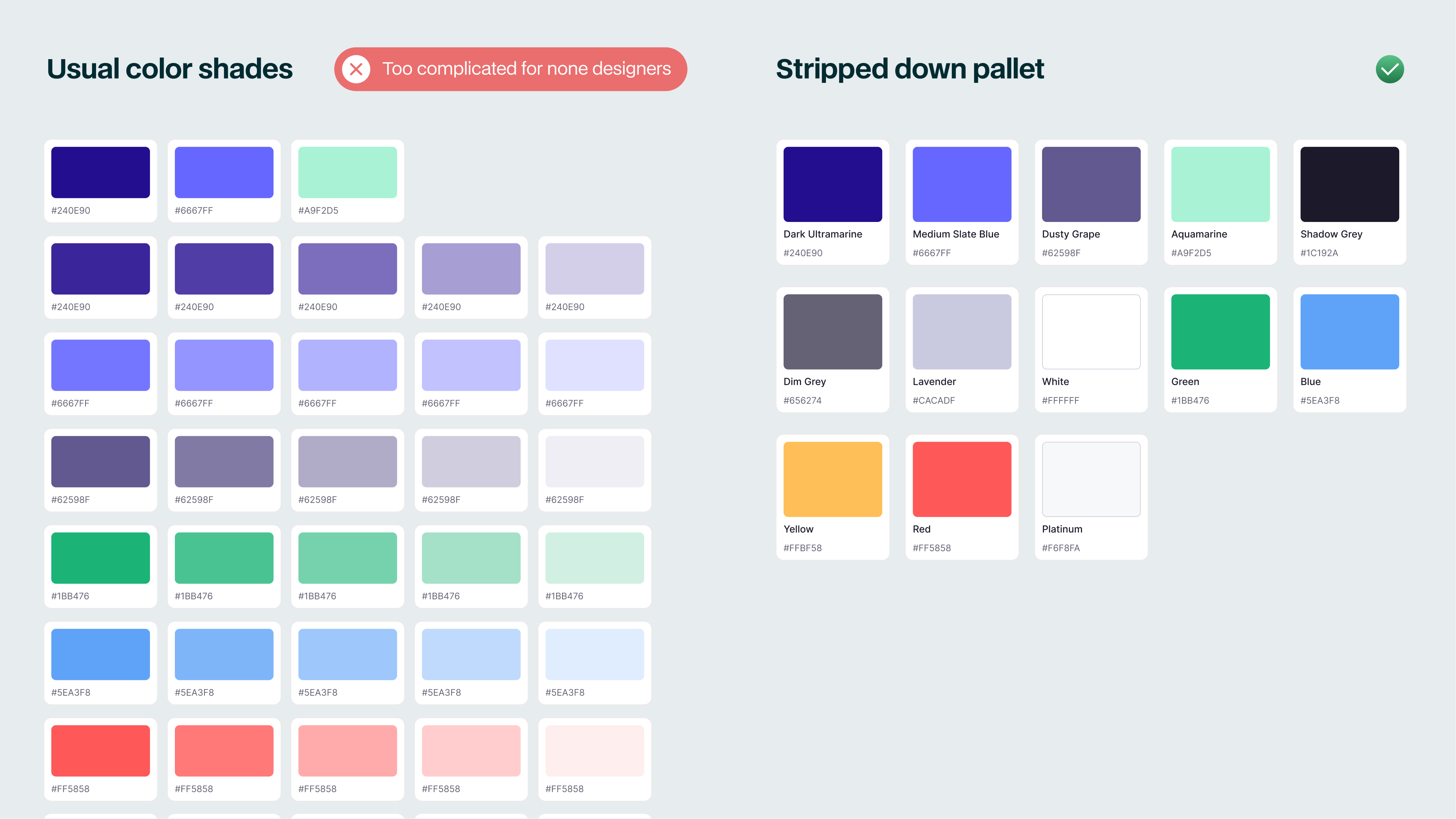
- Color: a primary purple, a dark neutral, a grey range, and status colors.
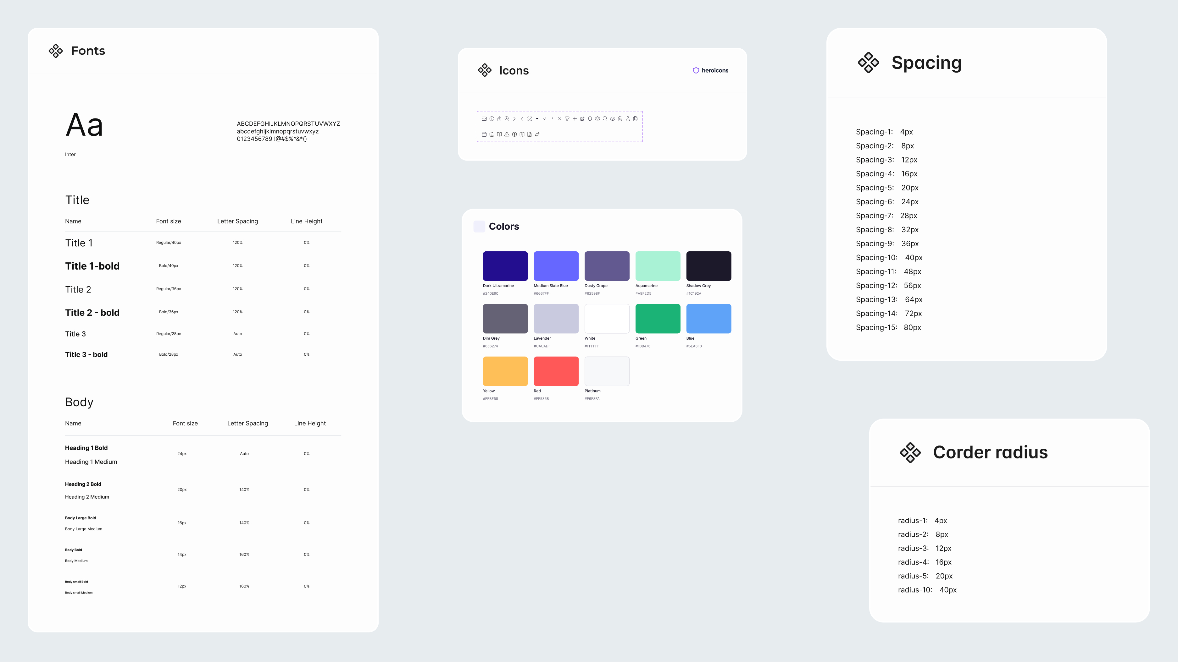
A deliberately small palette. A normal palette runs to many shades; this one is lean on purpose. A non designer can hold a handful of named colors in their head, and AI has fewer ways to reach for the wrong one. The limit is what keeps non expert output on brand.
To make sure everything is structured and reusable, the foundation was laid at the start in Figma itself.
Tokens, the raw decisions: color, type, spacing, radius.
Patterns, the repeatable sections: tables, the nav shell, detail tabs.
Components, the reusable parts: buttons, inputs, badges.
Templates, the page skeletons a new screen starts from.
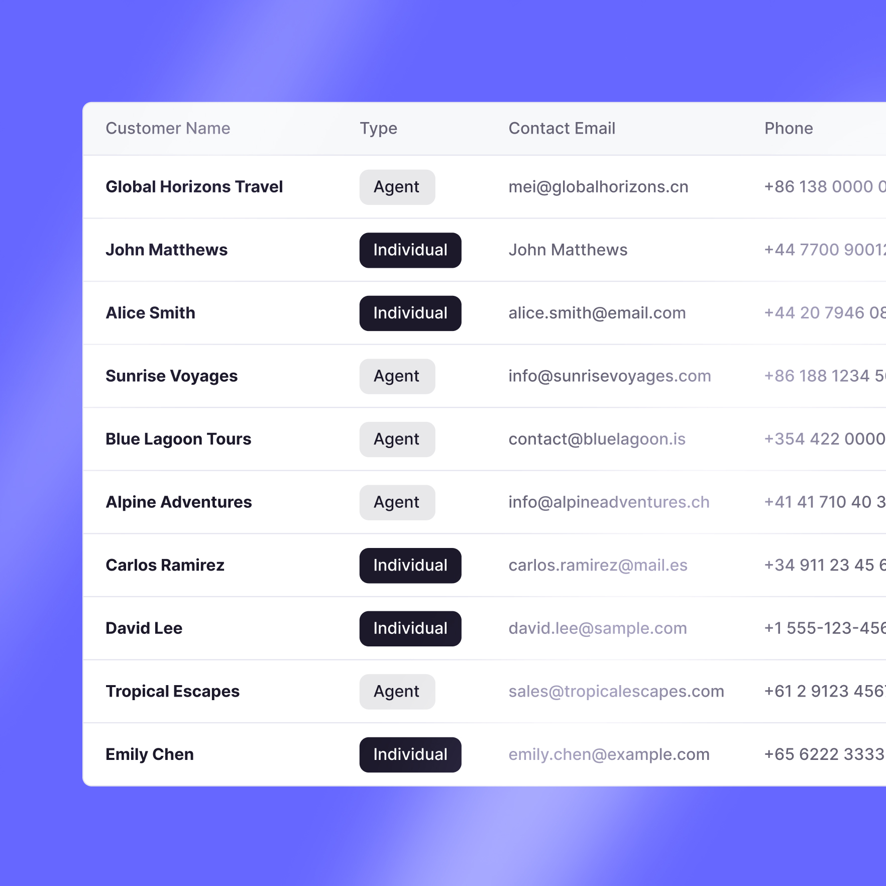
The data dictate the design
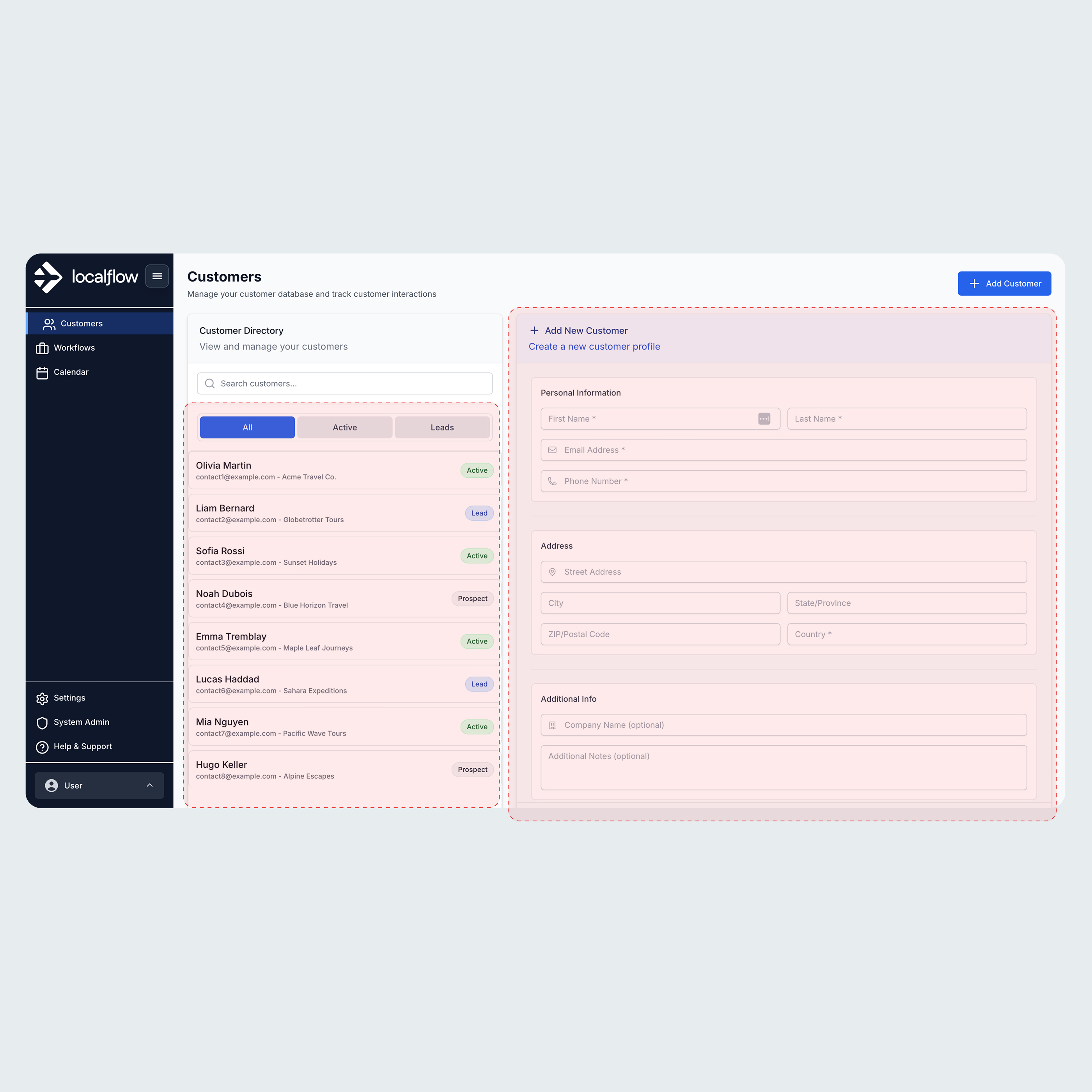
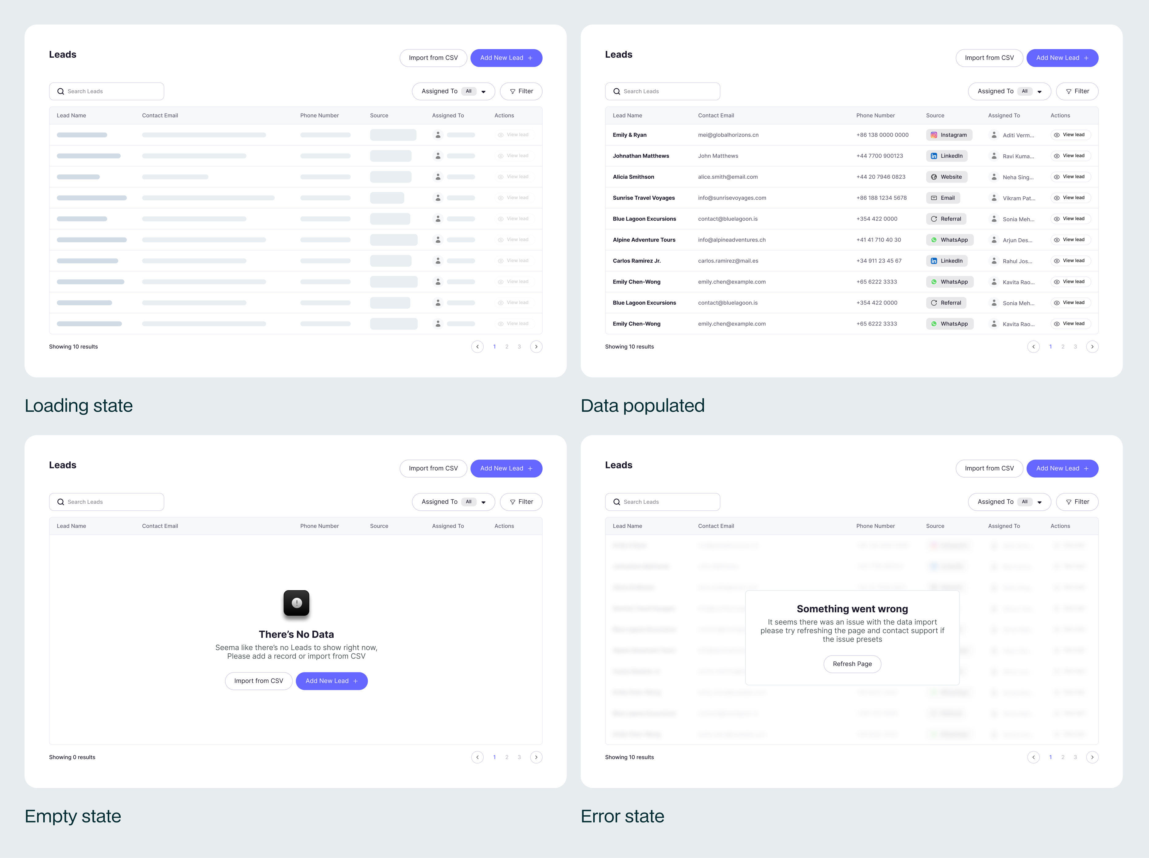
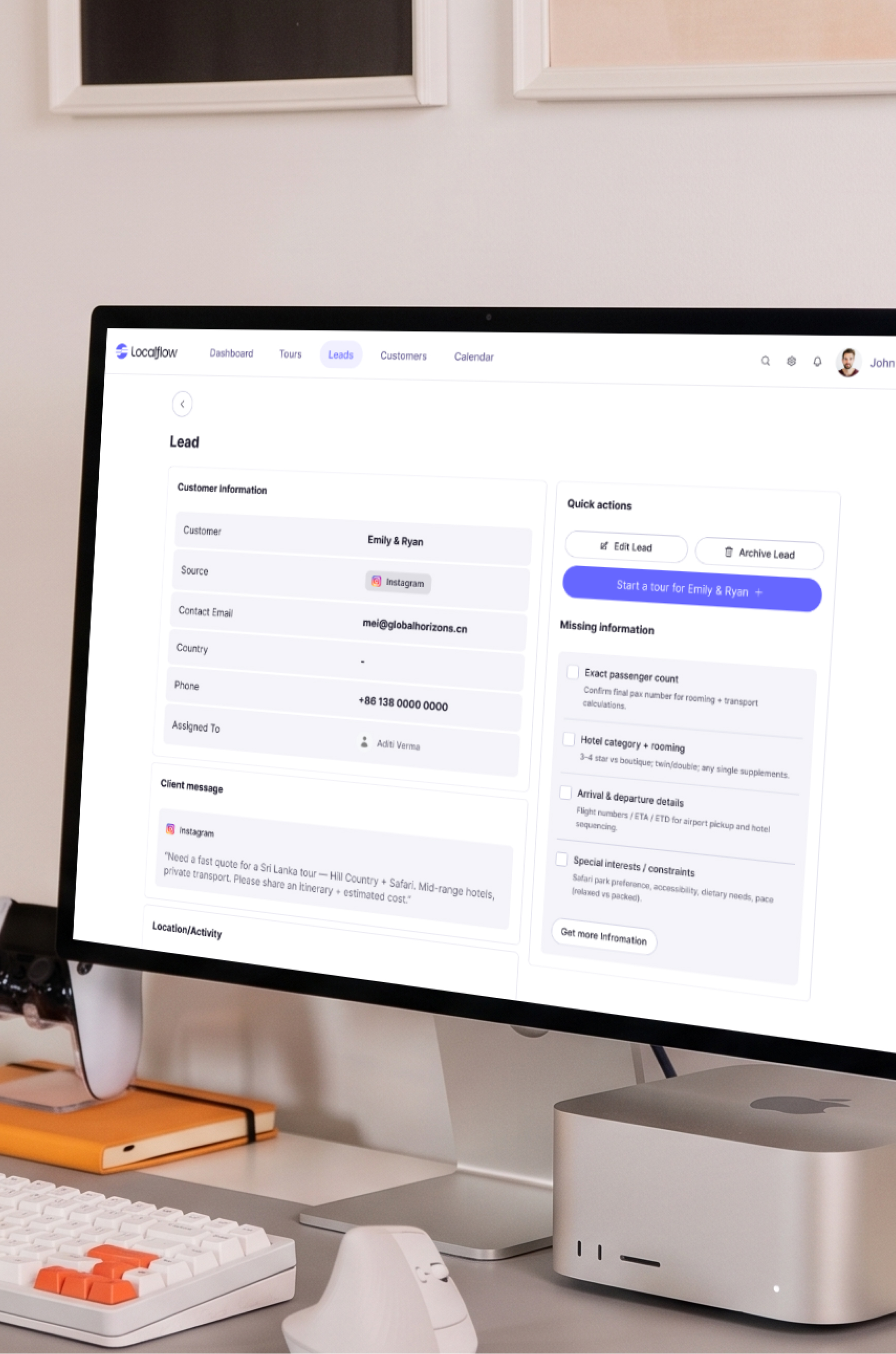
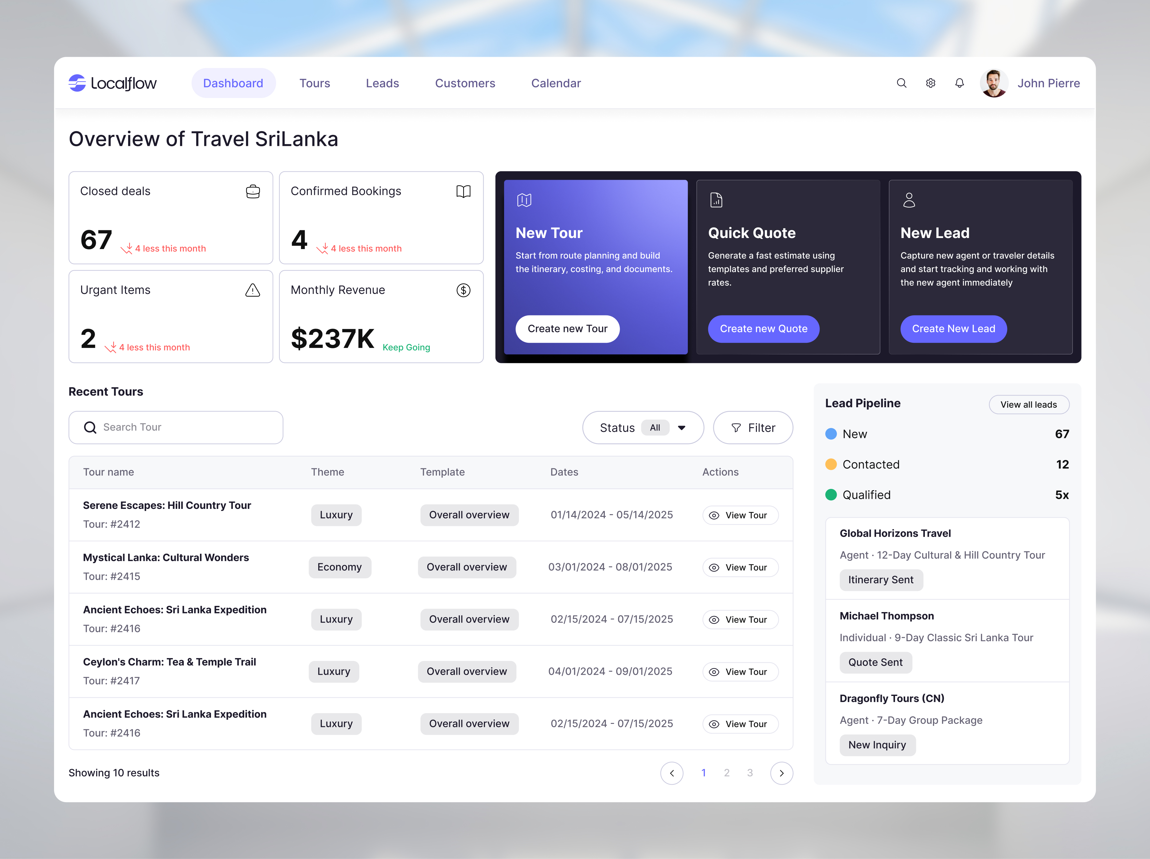
A demo runs on tidy data. A product does not, so the screens were built around the real data LocalFlow handles. Itineraries run three days or two weeks, leads come from five different channels, customers are agents or travellers. The badges, the type splits, the empty and loading states all came from that real data, not from a mockup.
Strict by design
A loose system relies on everyone making good choices. This one could not: the people building screens are not designers, and some are not even people. So it is strict on purpose. Every part has fixed rules and is bound to tokens, so a screen from a new hire or from AI still looks like it came from the same place.
A few places that strictness lives.
Cards. Every card is built from the same tokens, so they all look like one object.
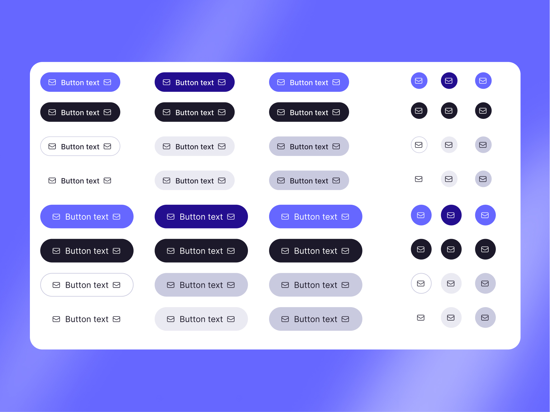
Buttons. One button holds the whole hierarchy, set by a property, never redrawn.
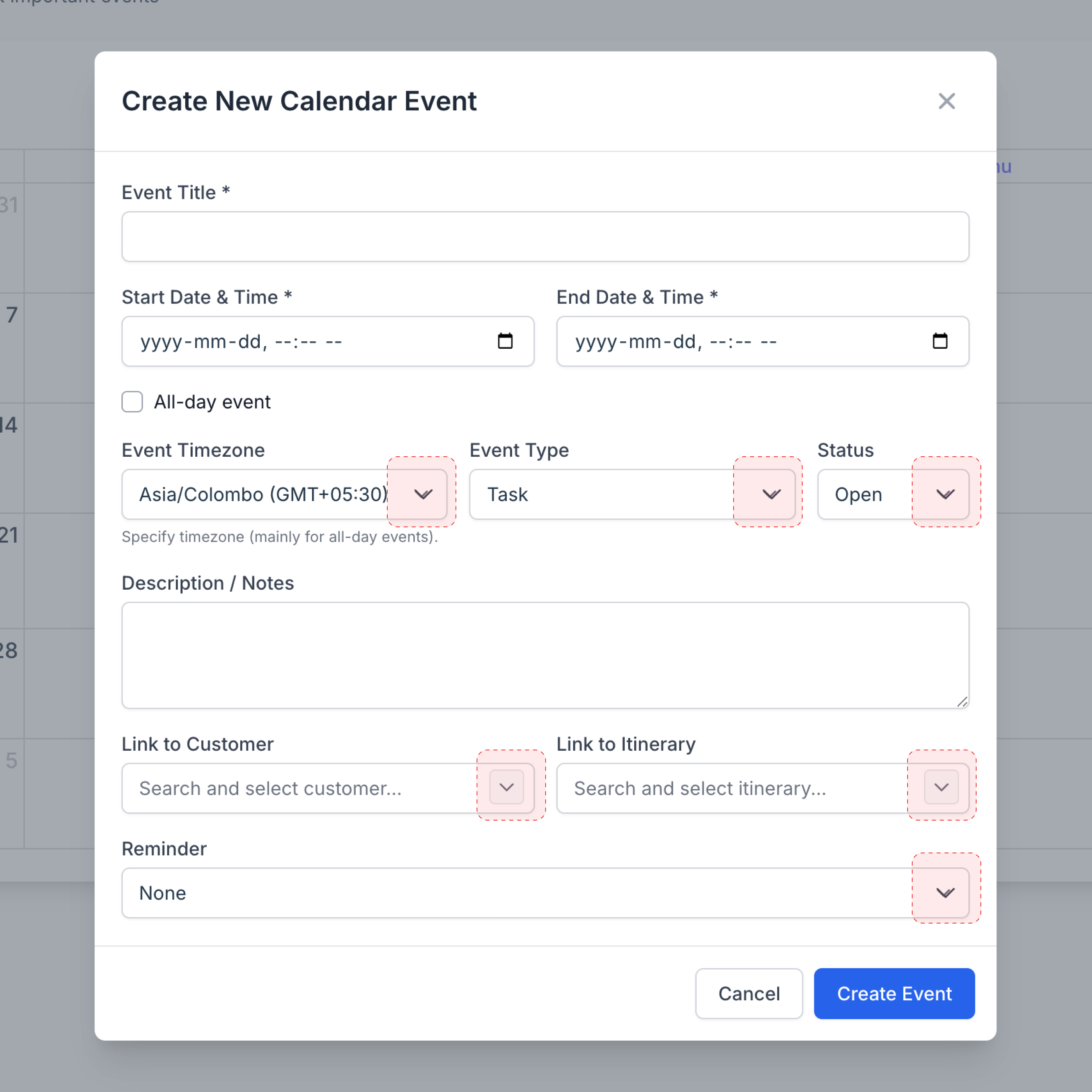
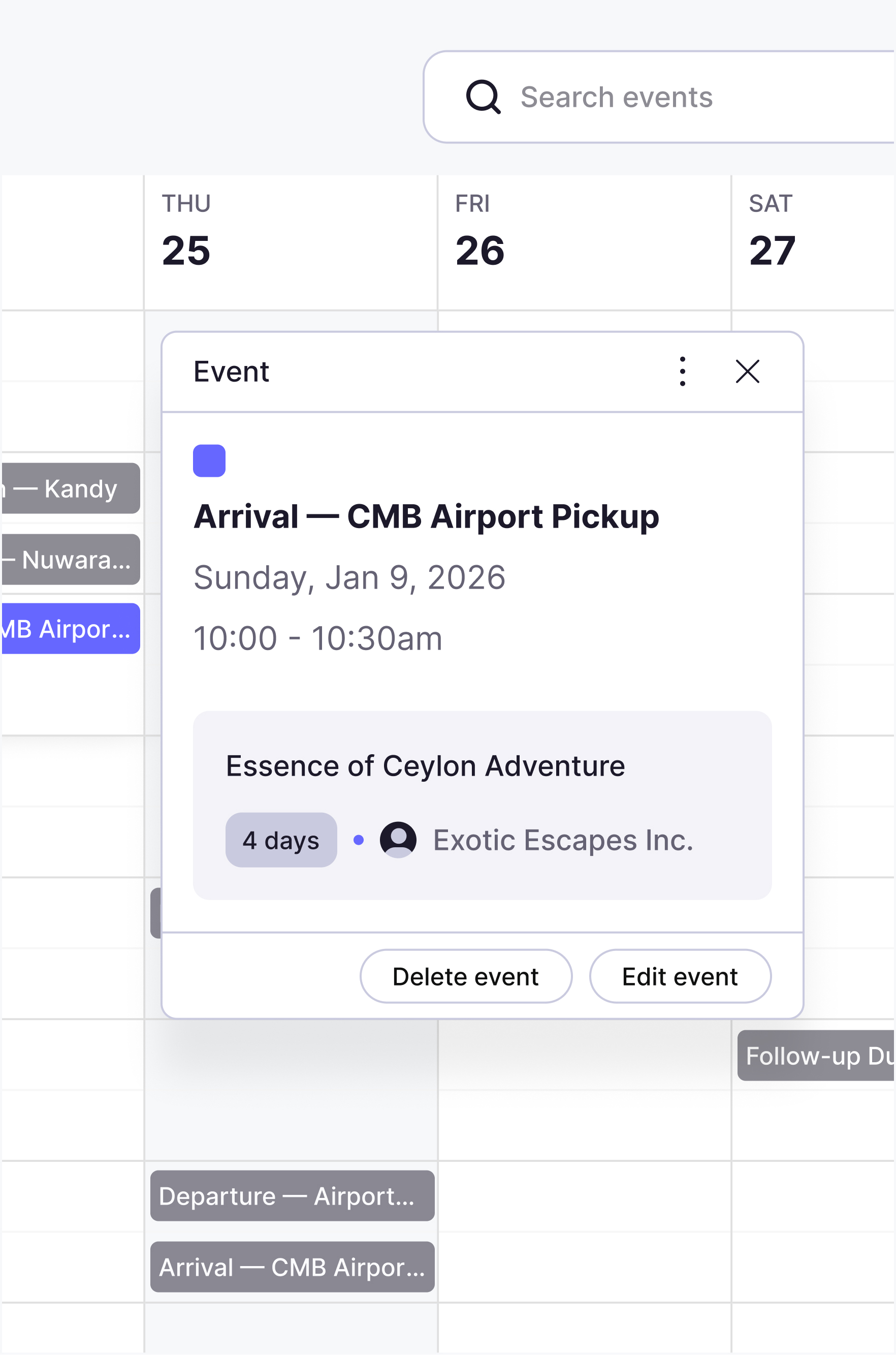
Popups and dialogs. Each kind of popup is predefined, so you pick one instead of building it.
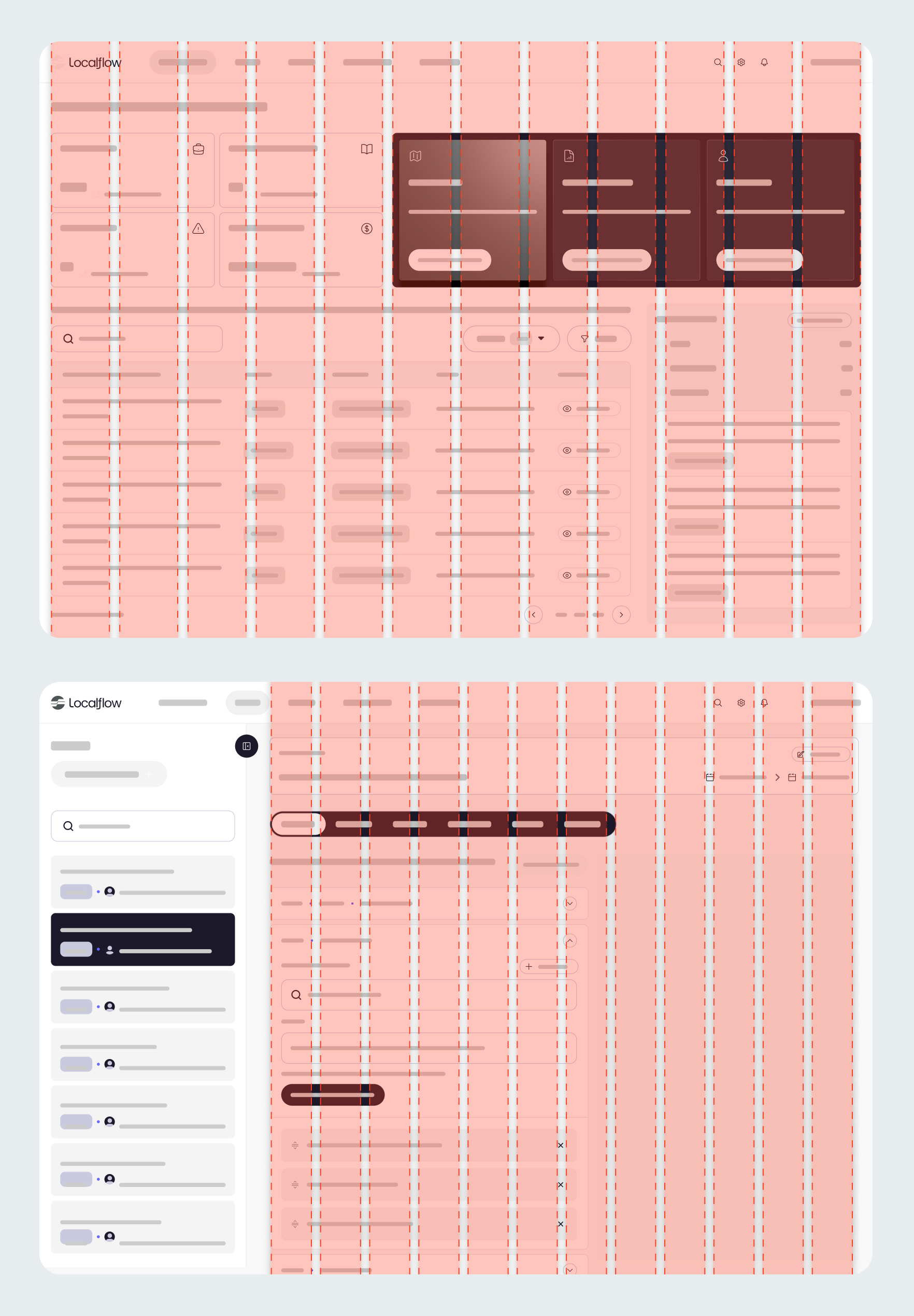
The layout grid. Every screen sits on a named layout, so new screens land aligned.
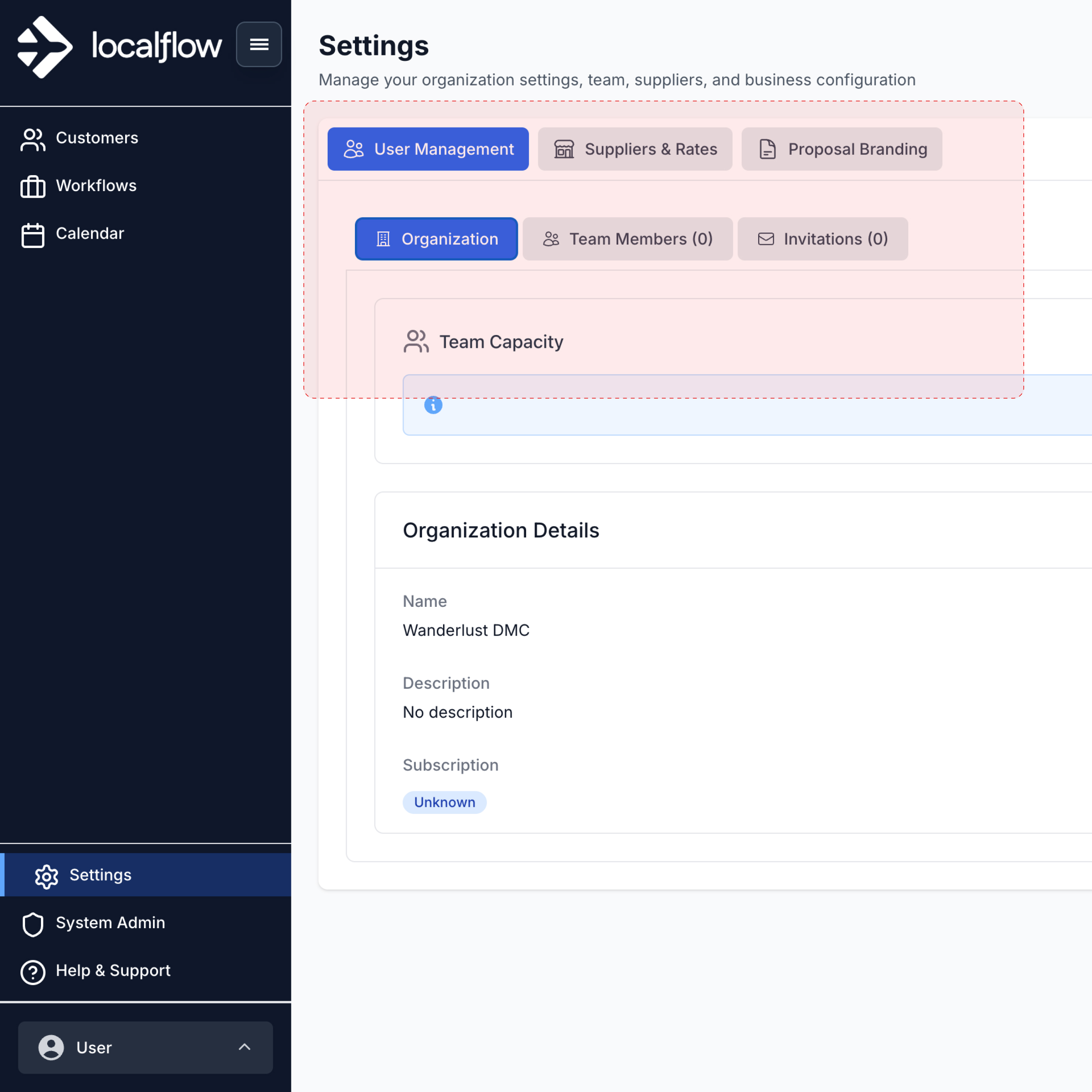
States, not just screens
A prototype shows the happy path. A product has to hold up with no data, while loading, and when it breaks. Every core view was designed in all four states, so the team never has to improvise those moments later.
Patterns and templates: where it pays off
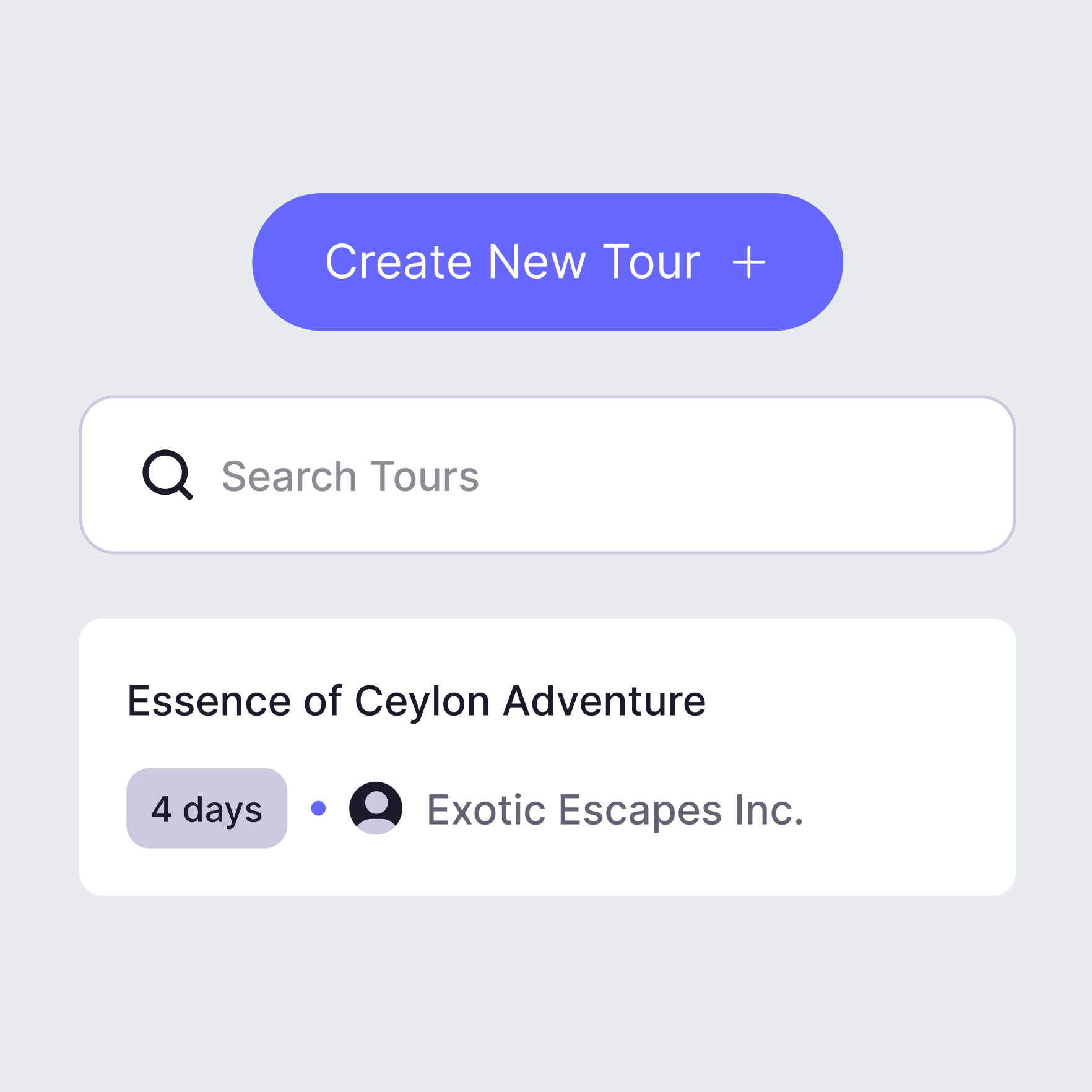
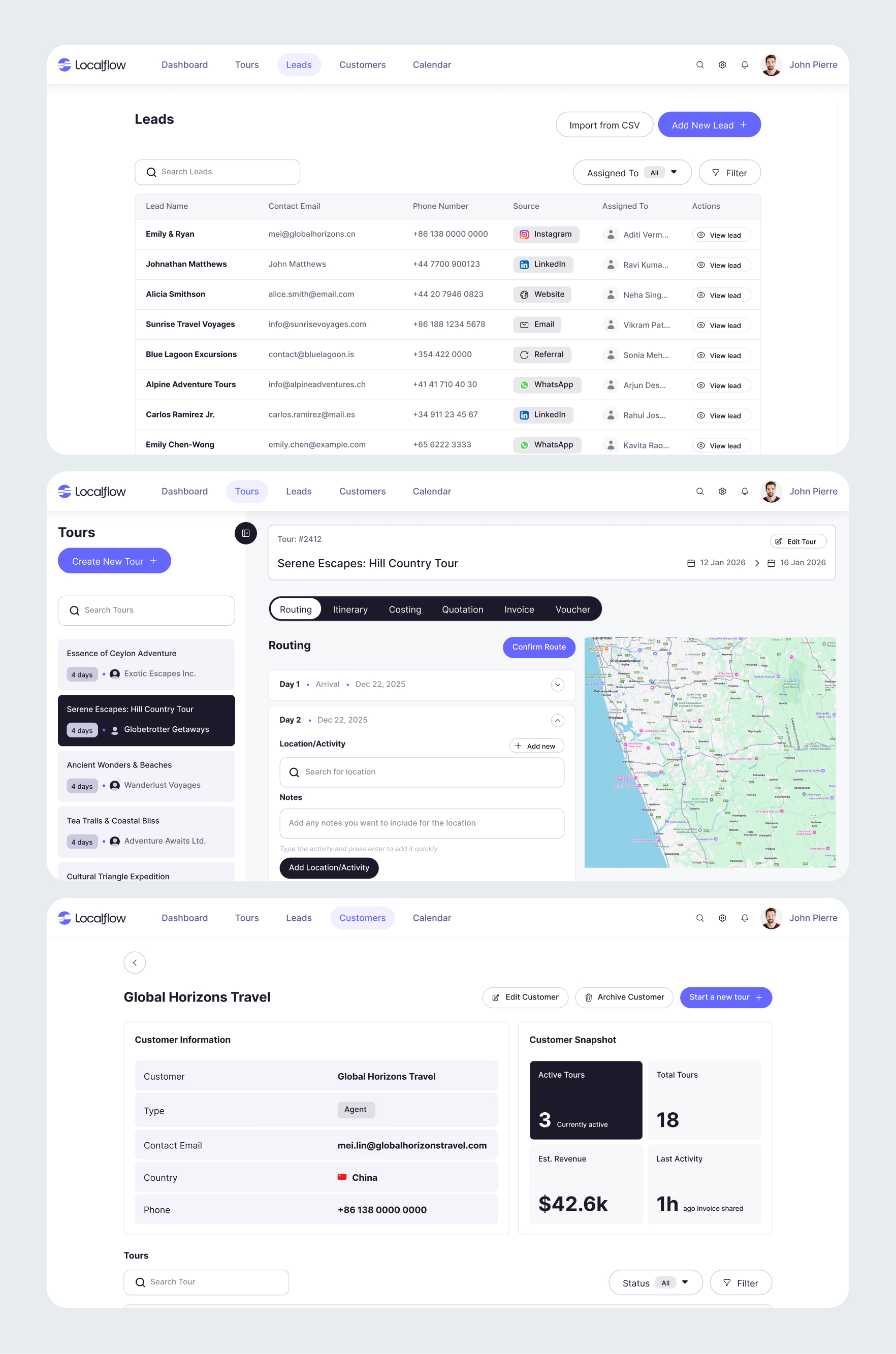
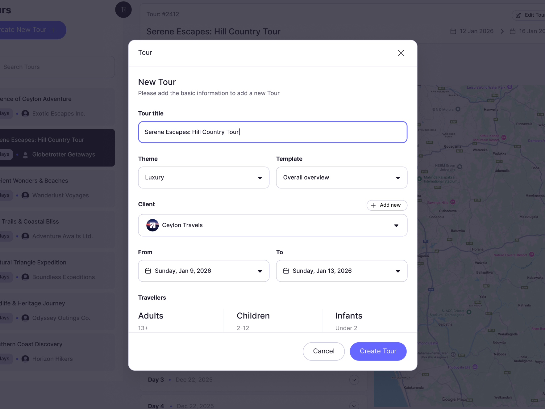
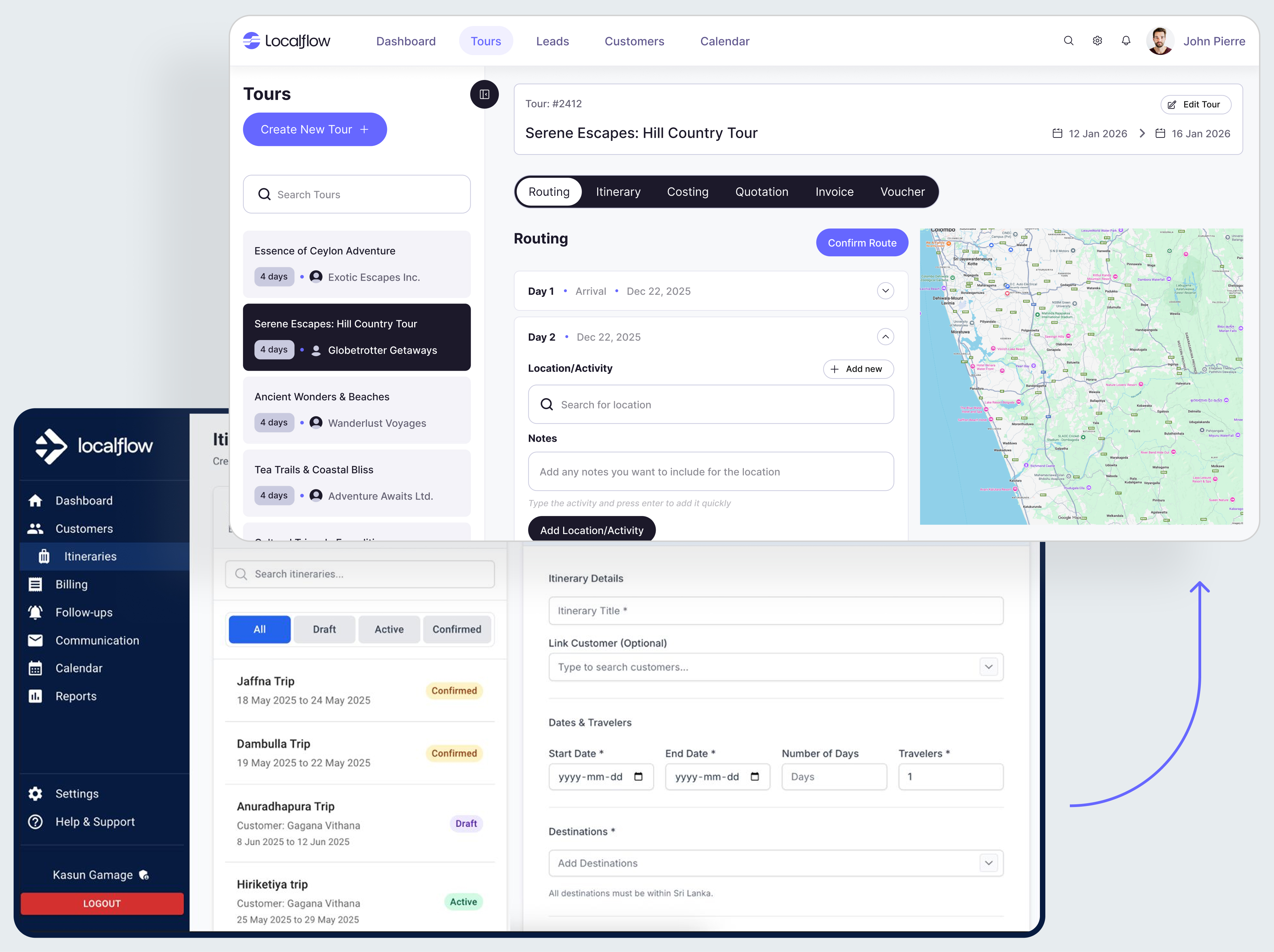
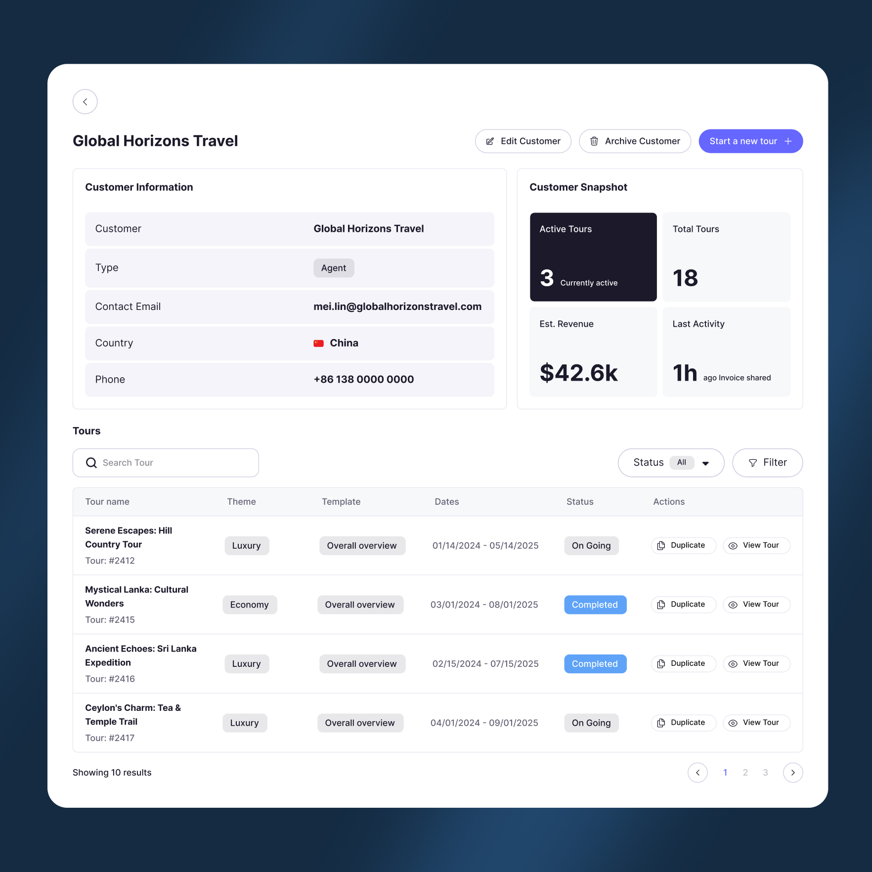
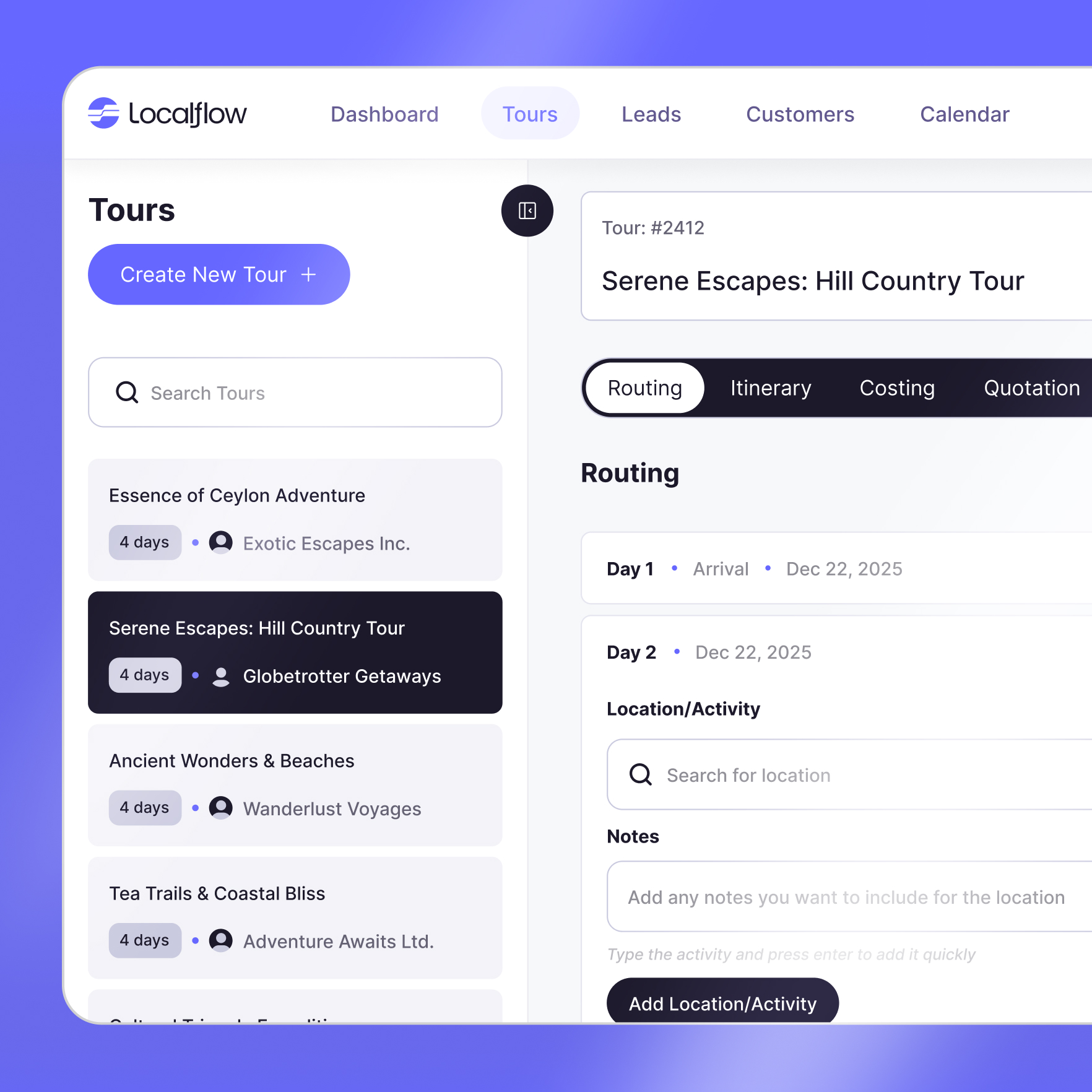
Most of the product is a few repeatable patterns: the nav shell, list pages with search, filter and pagination, and detail pages with tabs. A new screen starts from a template, not a blank canvas.
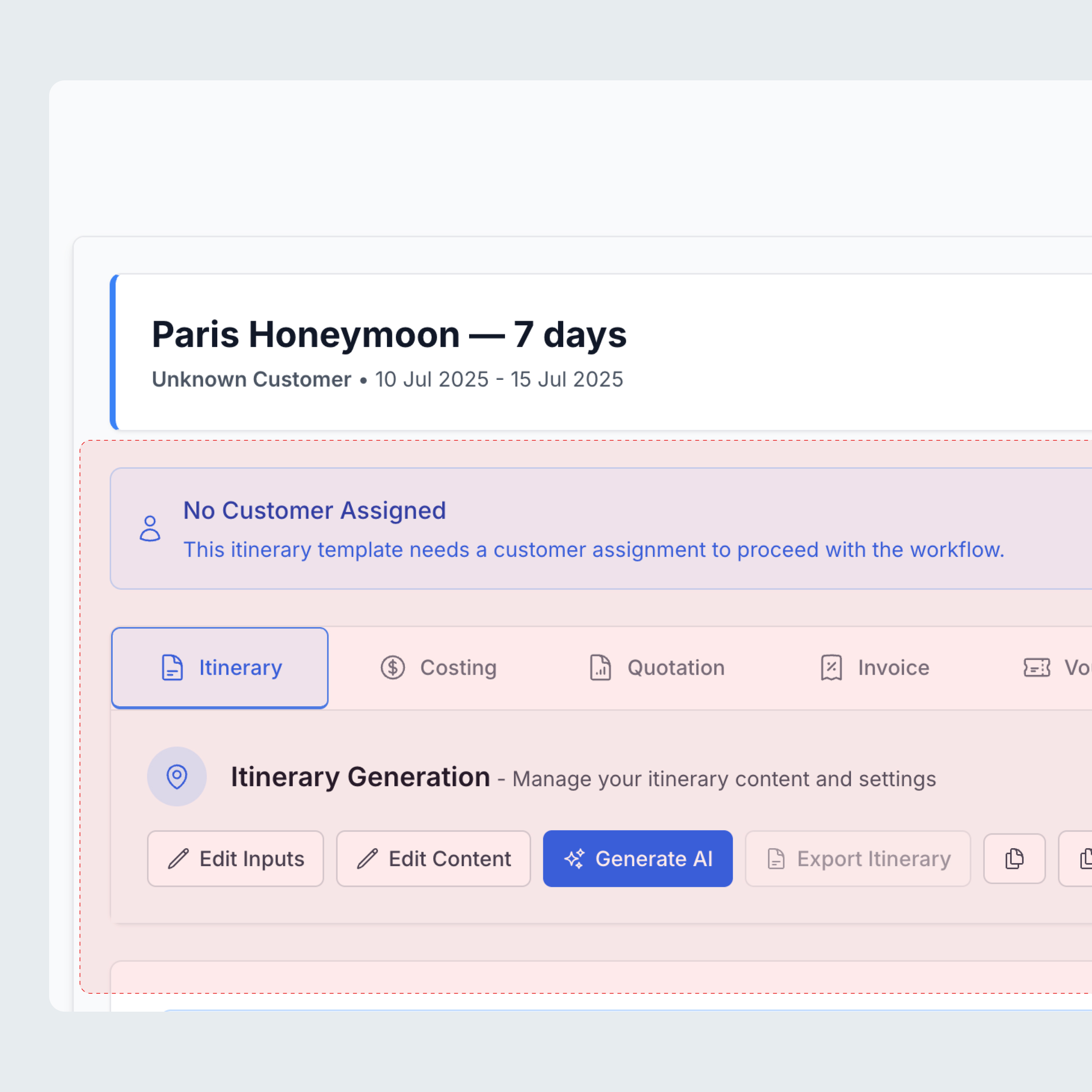
The real test is the hardest screen. The day by day tour builder, with live map routing, is built from the same parts as the simplest list.
The build flow: the next screen, in minutes
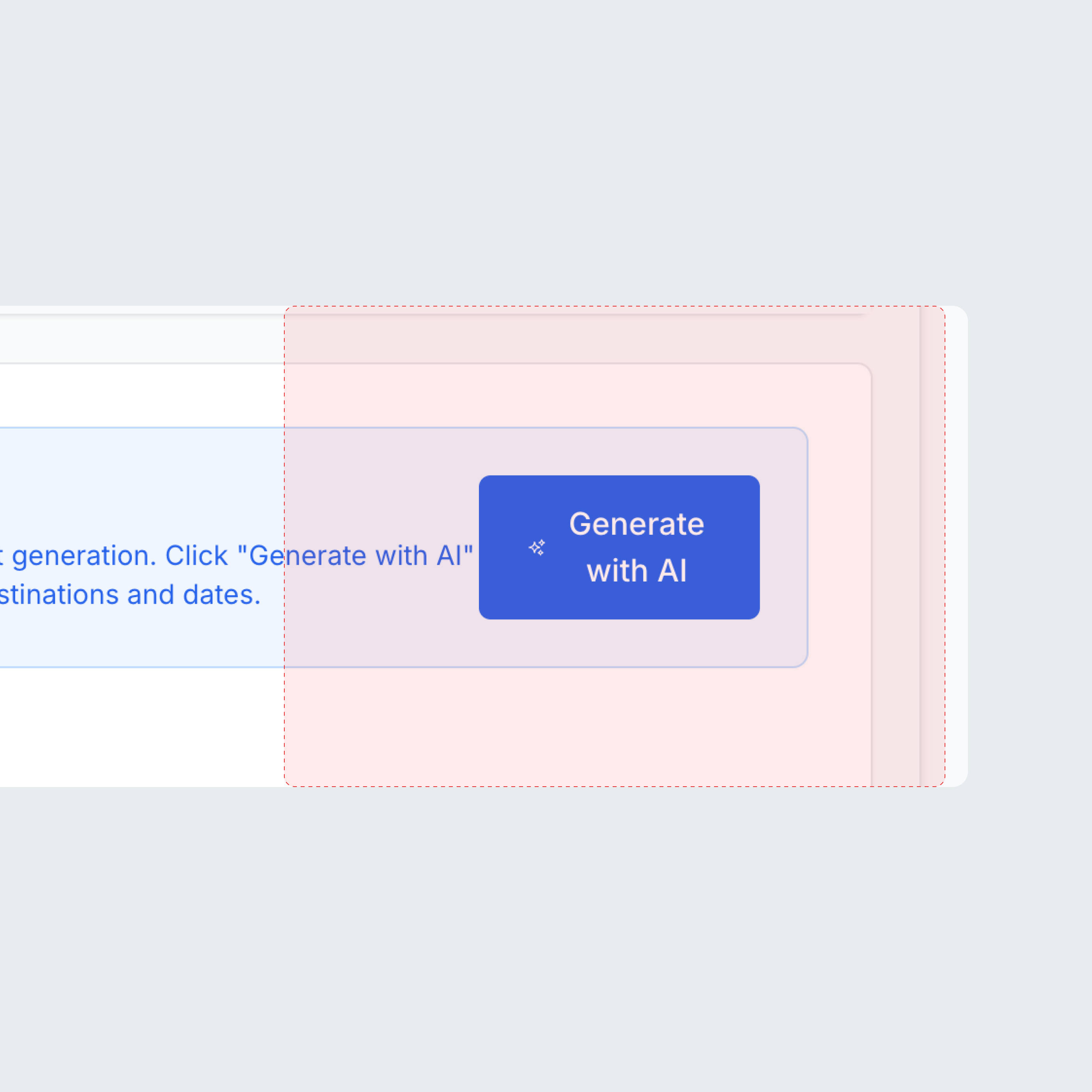
This is the proof it worked. Once the product was reduced to tokens, components, patterns, and templates, a new screen stopped being a design task and became assembly. With the system as the source of truth, variations could be generated fast and on system using AI alongside Figma, then refined by hand.
The constraints did double duty: a lean palette and fixed tokens gave AI fewer ways to go wrong, and the AAA check ran on every generated screen, so output stayed on system and accessible without a designer reviewing each one.
The point was never the screens already in the system. It was the screens the team could ship without a designer on each one.
Outcome
By the end, the team could build and ship new screens from the system on their own. Consistency comes built in, and a new screen is minutes, not a project.
To hand the system over, I packaged everything into a Claude skill. The screens, style guide, variations, variables, and tokens are all baked in, along with a cookbook and design guidelines written as markdown files the skill works from.
To make a new screen, the team just describes what they want. From there they can pull it into Figma to refine, or generate it online from the same skill. That gives them the freedom to keep producing screens as the product grows, without standing up a full design team.
LocalFlow went from a prototype that looked the part to a product that can keep growing without the design slipping.
Also on this project
This project also included the LocalFlow brand identity.
View the LocalFlow brand work