smokingdots
Complete Rebranding of a Startup to Earn Client Trust and Attract Talent
Role
UI Designer / Identity designer
DELIVERABLES
Brand identity / Website design
Location
Colombo, Sri Lanka
website screenshot
Summary
Smokingdots is a full spectrum development company that is focused on web and mobile development targeted to be a technology arm for anyone. As they were gaining some traction having worked with a number of reputable clients the company was looking into the possibilities of updating their brand and website. The current site was not meeting their expectations and was not providing them with a good way to carry out sales and attract good potential hires.
Problem
Having worked with Smoking Dots before I was brought on to work on the new brand identity and reimagine the logo and the website this is the process I took with the stakeholders of smokingDots in order to create the website.
Logo design
cards with logo laid out
Current logo
The old logo for smokingdots, a young tech startup that is a full spectrum web and mobile application development company. is having some major flows that are becoming a hindrance to the brand
old logo of smokingdots
This is some text inside of a div block.
  • The logo is not easily readable
  • In small scale the logos simply reads dots as the "smoking" part is too thin
  • The logo is not simple there are too many effects such as the negative space, making things italic, having thin vs thick typefaces
Introduction of a logo mark
Having a logo mark seemed to be the best way to go forward as the word "Smokingdots" was too long to be added without making the logo too complicated. By introducing a logo mark I will be able to make sure the brand is recognizable just with the logo mark and the company owners can easily choose which places will just need the mark and which will need the full Logo
logo mark combination
logo mark construction design
Anatomy of the Smokingdots logo mark
The logo mark was constructed using the "S" and the "D" in smoking dots and using the negative spaces that were created when having the two letters together created a very simple logo mark that is easily recognizable and understandable and it created the look of a dot with a smoke symbol coming out of it
Final outcome
Outcome
checklist
  • The logo is easily readable
  • Logo mark is legible is small scale
  • Simple logo, minimalistic and easily identifiable
Website design
website screenshot
Why
Before starting the work we had a meeting to to understand why they need a new website and what are the issues of the current site
Current website issues to be addressed
  • With the rebrand the site needs to be aligned to the new brand
  • Current website does not get many return visits from people
  • There are complaints from visitors to the site
  • The amount of business coming from the site is quite less
  • Current website does not reflect the what the company does properly
  • There is no proper direction to the site for different type of visitors
  • Proof of work is not provided properly which makes the brand look less trustworthy
  • It’s hard to attract potential employees with the current site
Project success points
  • Follow the new branding
  • Be easy for the visitor to navigate
  • Be easy for the visitor to navigate
  • Provide pipelines for different type of visitors to find what they want
  • Reflect the values of the company
  • Provide ample proof of the capabilities of the company
  • Easy call to actions for a visitor from anywhere in the site to reach out
  • Be people centric
  • support downloadable and sharable content
  • Should work as the central point to visit from all the marketing materials
  • Show off the process the company follows
  • Be something the stakeholders can be proud of
Defining the reason for the redesign is key with the client. It will provide me with insights on the problems of the site, a guideline to define a successful project and for the client it will be a chance to solidify their needs.
Analysis of the existing site
To understand the problem of the current website we decided to breakdown the existing site to understand what are the issues of the current site from a visual perspective and a business perspective
old smoking dots website screenshots
Current website issues to be addressed
  • Readability
  • Color contrast
  • Size Contrast
  • Relatability
  • Consistency
Potential website visitors
For each set of potential visitors, user personas were created and run through simulated journies with the wireframe of the website design. Screens went through iterations depending on the results.
Clients
Startup and other cooperations that wants to hire a team for the development of a product
Agencies
Other agencies that wants to outsource the development on behalf of their clietns
Potential hires
Startup and other cooperations that wants to hire a team for the development of a product
Pre-design work
FInishing up
Visual design
From the workshops with the client the user personas, information architecture, wireframes and site map visual designs were created starting from the home page to set the whole site look and feel then moved down to all other pages.
Project outcome
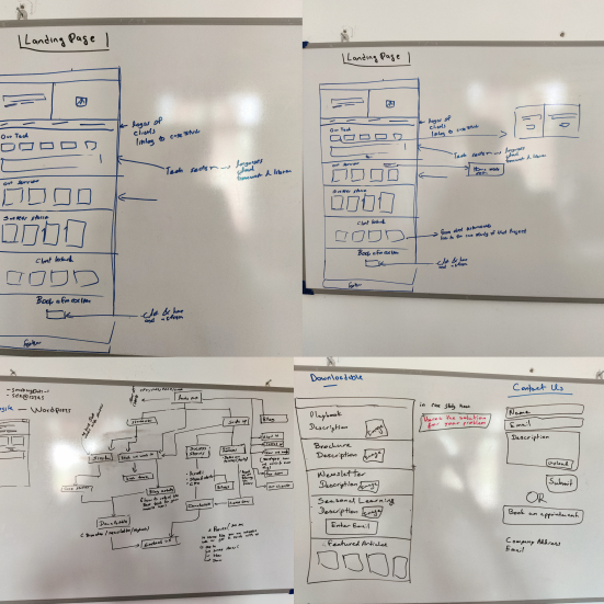
Being closely involved with upper management, the marketing team, and the developers allowed me to navigate the project smoothly.

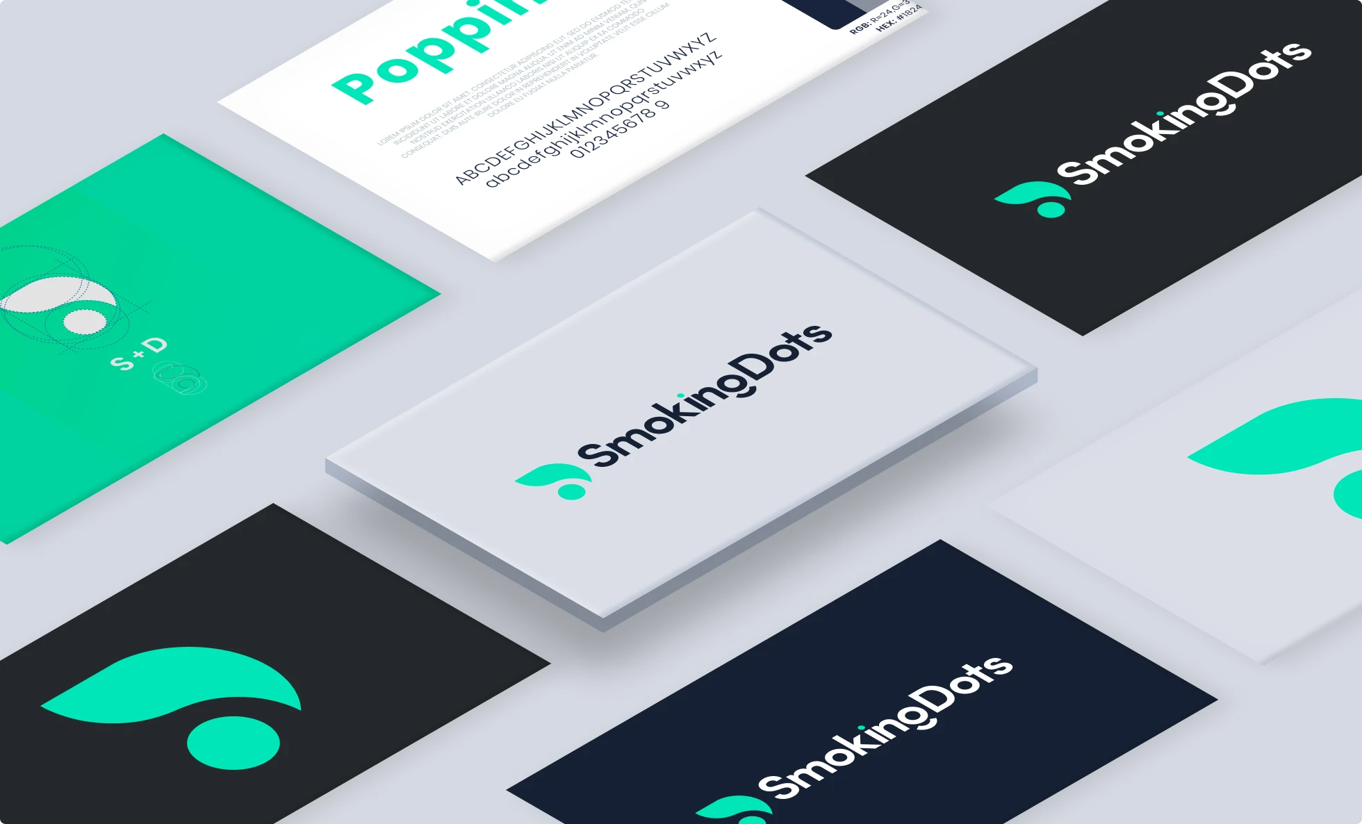
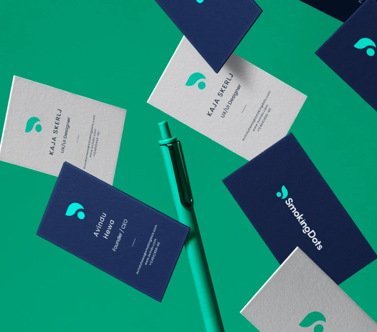
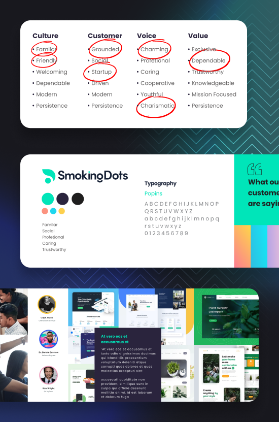
The rebranding was a success, solving the issues the company faced with their old logo. The SmokingDots team could easily use the new logo across all marketing materials and presentations without any hassle.

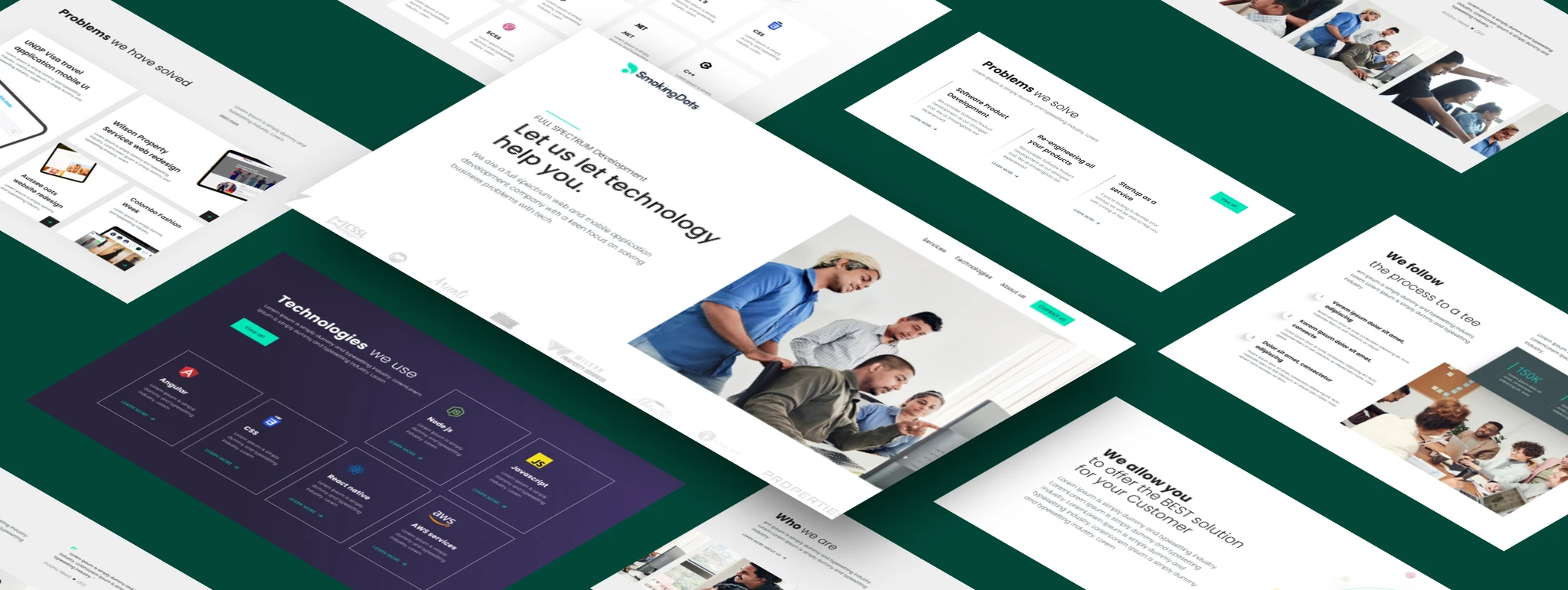
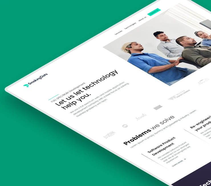
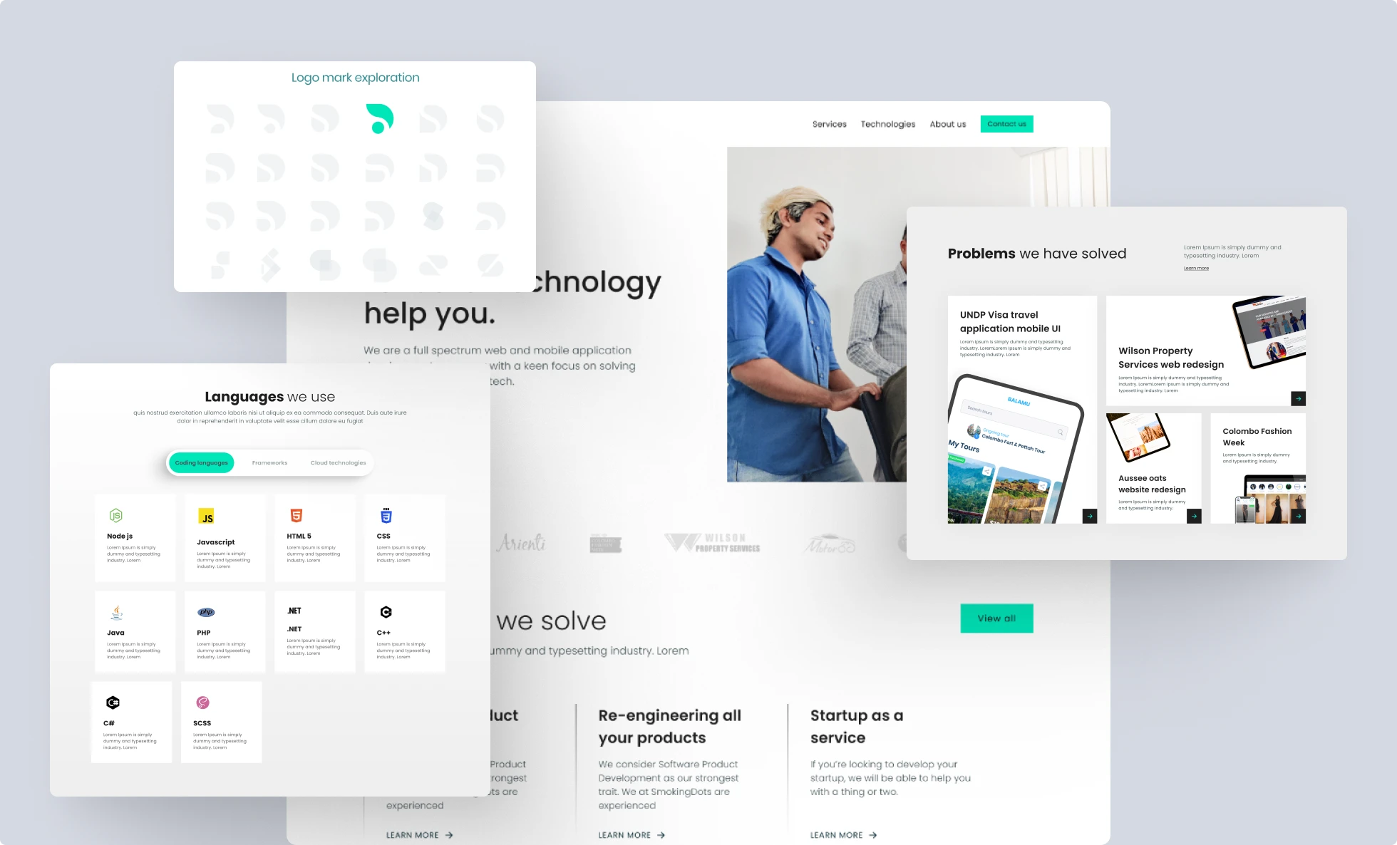
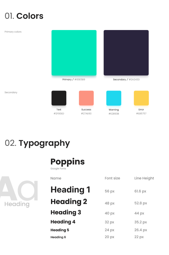
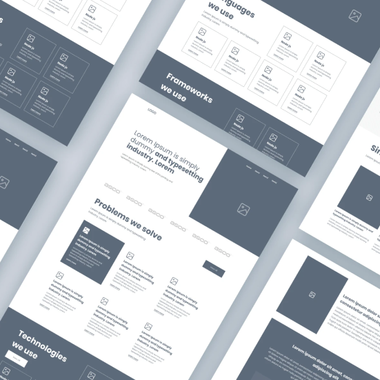
The new website design gave the company a more professional and trustworthy look, helping them attract both new talent and clients. It also made marketing efforts much more effective and easier for the team to manage.
Testimonial
Don't just take my word for it
Working with Peshala on the rebranding of SmokingDots was a great decision. He took our outdated logo and branding and transformed them into a modern, polished design that truly fit our vision. Throughout the process, he guided us through multiple iterations, explaining his thought process at each stage. The result was exactly what we needed. We wouldn’t hesitate to work with Peshala again.
Avindu Hewa
Co-Founder / CEO

peshaladayanatha@gmail.com

linked-in icondribbble iconbehance icon
© 2025 All Rights Reserved – by Peshala Dayanatha