Making Things Wiggle With Rive (Professionally)
Central black square with white R logo surrounded by four dark panels showing UI designs of a contract document, music player with vinyl, cute white cat figurine, and potted plant illustrations.
Summary
Most apps and sites today feel like they're in a custody battle for your attention. Buttons are screaming, banners are blinking, someone’s always trying to sell you something - it's chaos.

And honestly, one of the best ways to gently win someone’s attention (and keep it) is through good animation. Not “Las Vegas casino” animation, I mean smooth, meaningful motion that makes the whole experience feel alive.
Discovery
& Research
Previously, I was mostly relying on CSS animations and the occasional JavaScript/GSAP  just to move things into the viewport.

And while that did work quite well, it also meant a lot of coding, tweaking, adjusting, breaking, crying, fixing, and then breaking again. The truth is...

I’m a visual person.
I’d rather design the thing than fight with syntax just to make a button slide 4 pixels to the left. So naturally, this pushed me into the great hunt for “a better way.”

Enter: The Animation Rabbit Hole
So I went hunting. I tried all the usual suspects:
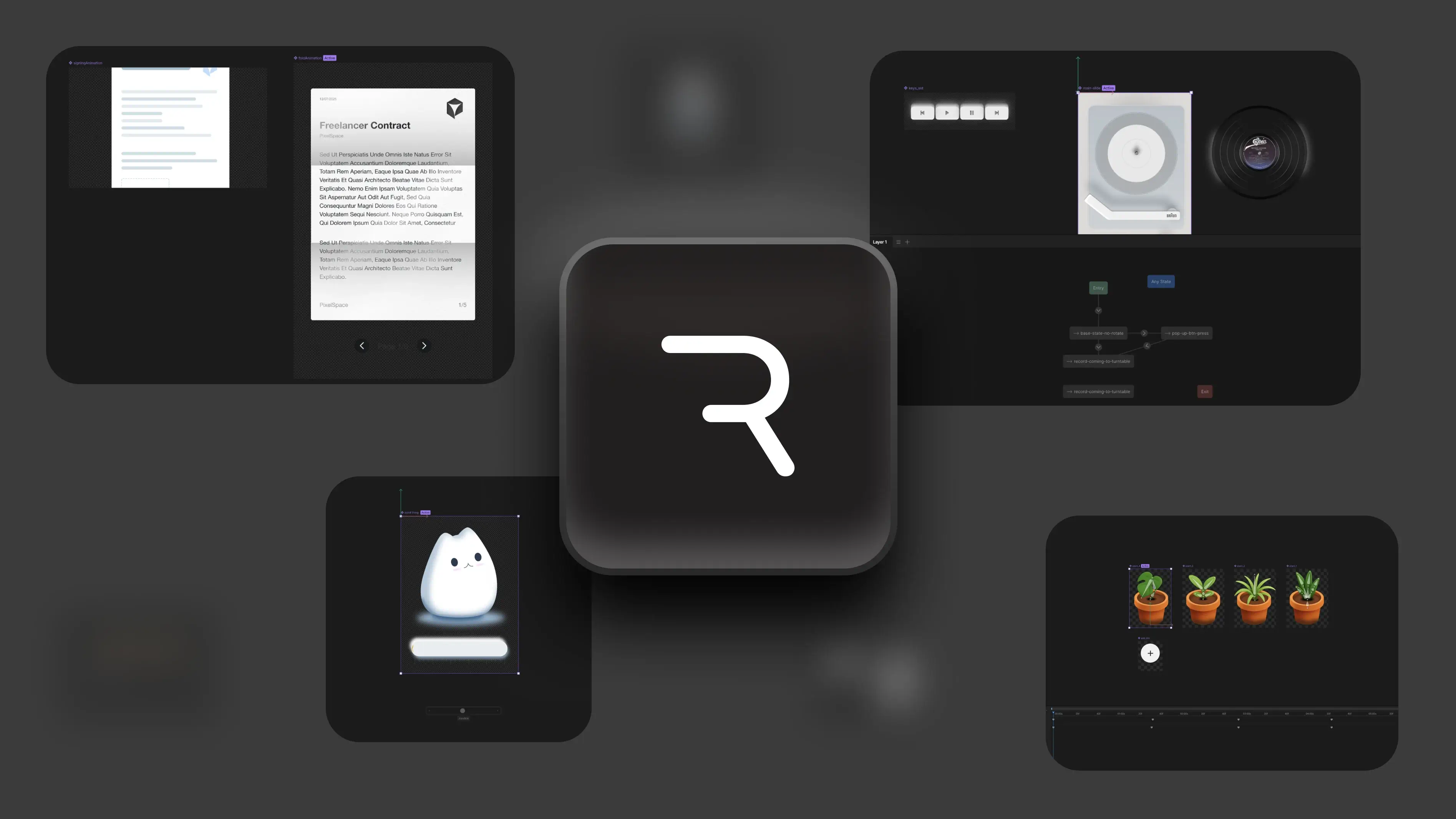
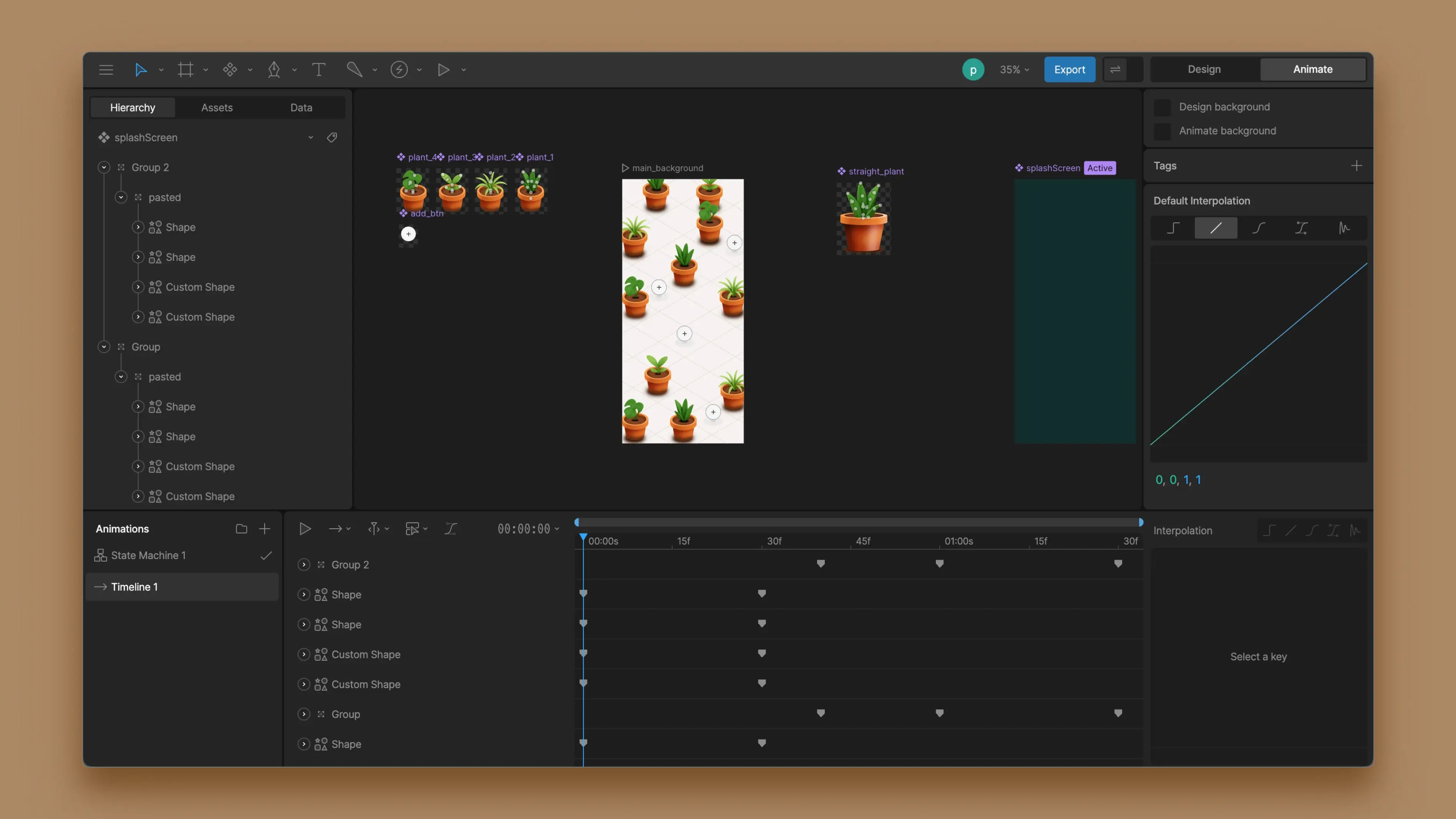
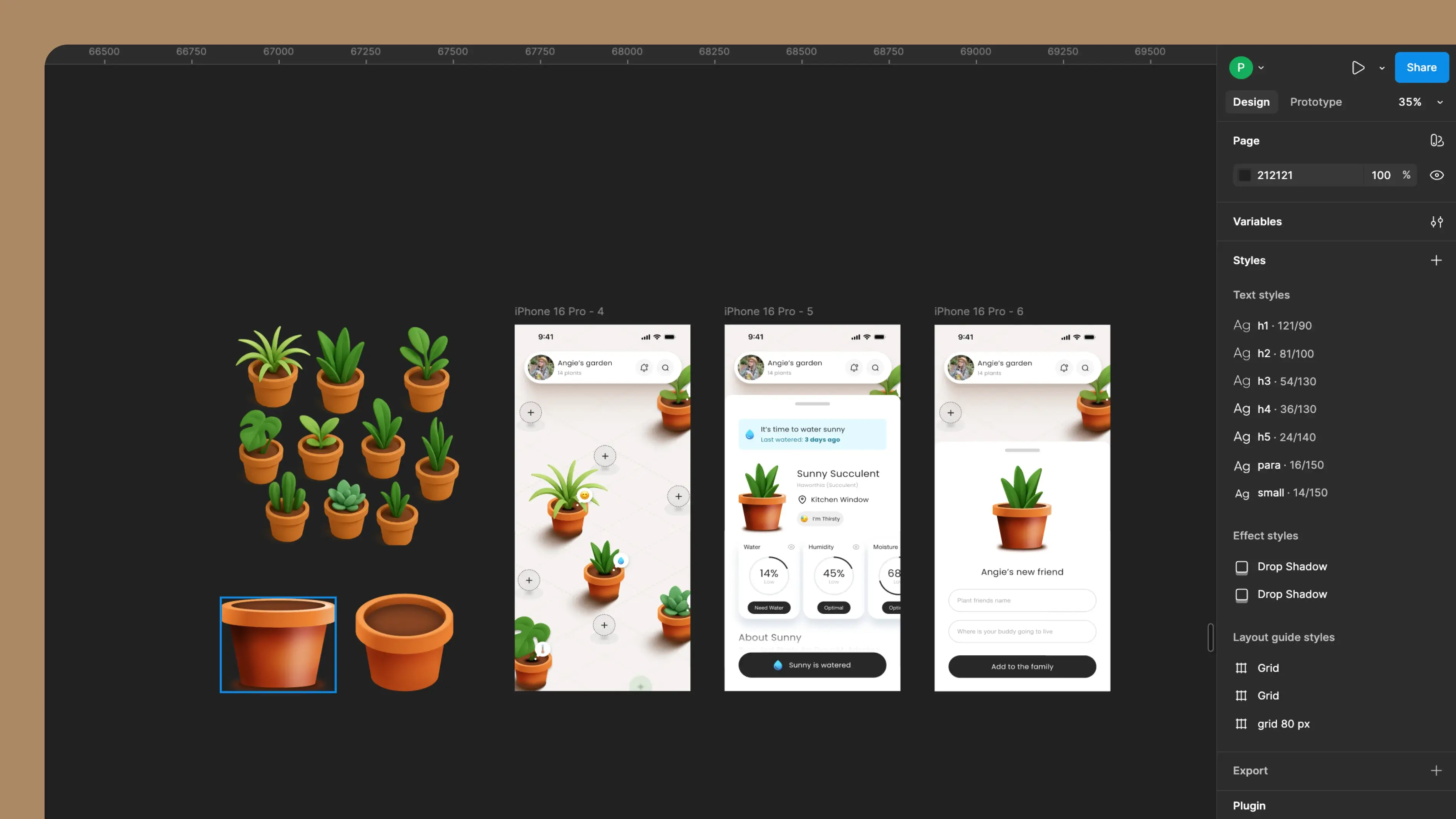
  • Lottie
  • CSS animations
  • Framer motion
  • A couple of GitHub boilerplates I definitely shouldn’t have trusted
  • And a few experiments involving too many keyframes and not enough patience
But Rive?
Rive was one that felt like it understood what I needed flexibility, interactivity, and an interface that doesn’t make me want to yeet my computer.

And most importantly it is compatible with every implementation I wanted to do.
So… What is Rive?
In the simplest terms:
Rive is where you design your animations, wire them up with logic, and then hand them off to your app or website without the whole thing catching fire.You get a visual editor (yay), state machines for logic (still yay), and exports that work on mobile, web, and basically anything that has pixels.
Animation design software interface showing plant illustrations and animation timeline with keyframes.
Test 1
Working with Native Apps
Let's make some plants move
This whole project actually started with a small design competition in a UI/UX Discord channel.
The rule was simple (and slightly unhinged):

Design an all-in-one-screen app for managing plant health with no navigation.
Designing the idea in Figma
Before anything moved, grew, or wiggled, I laid everything out in Figma. How the interface behaves, how gestures work, etc. I wanted the UI to feel simple eventhough the interaction model was… not simple at all.
Digital design workspace showing potted plant icons and three mobile app screens for a plant care app called Angie's garden.
Planning Animations
I moved into Rive and built each plant with an idle animation with mesh warping (for actual projects, this should be built in individual elements to make the animation smoother).

Once the plants were done, I recreated the entire “planting sequence” with Rive, so each animation could be triggered independently, and I went ahead and made the splash screen.
Setting up the State Machine
I included logic that will trigger how and when each animation will play - keeping one main Rive art-board as the start that for all animations to run through.
Bringing Everything Together
To make testing smooth, I built the prototype in Swift so I could instantly test it on my ✨iPhone✨.

With the help of Anti-Gravity, I recreated the entire UI in Swift using the Figma screens as references. The layout came together fast. After that I hooked up the animation triggers to the interactions.
Test 2
Using Rive to Give Motion to Web
Helping some boxes stand out
This started as a pretty standard request:
“Can we have a bento-style section that explains a few key things?”

And yes, I could have shipped a normal grid with icons and called it a day.

But I wanted it to feel more alive. Subtle motion, little moments, the kind of thing that quietly holds attention without screaming for it.
Figuring Out What the Bento Needs to Say
Before I drew anything, I nailed down the content.

Each bento card needed a clear purpose. This part sounds boring, but it saves you later. because you’re not designing “vibes,” you’re designing meaning.
Webpage section titled 'Comprehensive Solutions for Your Digital Needs' with descriptions of services: Data integration and analytics, Custom application development, Virtual CIO/IT leadership, and Compliance expertise, each in separate boxes with placeholder images.
Trying the Illustration Styles on Figma
Next, I explored different illustration styles on Figma. Here I tested,
- Illustration complexity (too much looks busy, too little looks unfinished)
- Line thickness/stroke style
- How it reads on different breakpoints

- Consistancy
(each card should be unique, but still look like it's from one family)Once I landed the final look, I built the bento components cleanly on Figma, so they’re easy to reproduce on Rive. This mainly includes being very miindful of the shadows and other style elements.
Three stylized data integration and analytics diagrams with flow lines and icons, showing two incorrect examples marked with red X and one correct example marked with green check.
Rebuilding It on Rive
Then came the fun part: bringing the illustrations alive on Rive. At this stage, the goal wasn’t to make it look like a cartoon. It was to make it feel responsive and premium.

So the animation choices were subtle:
- Small loops
- Gentle movements
- Little “breathing” motions
Shipping It to the Website
Once the animation was ready, I exported it and hooked it into the site.

The win here is, I didn’t have to rebuild the animation with CSS or Webflow interactions.
Rive handled the motion, Webflow handled the layout - everyone stayed in their lane.
Next Steps
So far, most of my Rive work is focused on interaction, delight, and visual clarity. The next step is pushing that same motion language into places where things get… complicated.
Animation don't have to be loud to be powerful.

My goal moving forward is to make motion feel useful, not just impressive, especially in products that people  use all day. If the past projects were about learning what’s possible, the next ones are about learning what’s practical.

peshaladayanatha@gmail.com

linked-in icondribbble iconbehance icon
© 2025 All Rights Reserved – by Peshala Dayanatha